The Review Daemon: Gilbert and the Grim Rabbit
It’s been a long time, and The Review Daemon backlog of requested reviews has gotten rather long, so I’m pleased to have some guest reviewers on board with me to get things cracking at a faster pace. Today we’re reviewing Gilbert and the Grim Rabbit, by Wendy Heather Wood.
Synopsis:
Gilbert and the Grim Bunny (or Gilbert and Grim, for short) is a long-running slice-of-life comic about a colorful cast of talking animals and familiar spirits living on an island in the Pacific. It’s a fairly cute and light comedy that focuses mainly on watching the cast go about their daily lives as they interact, converse, crack wise, and tease each other.
Plot:
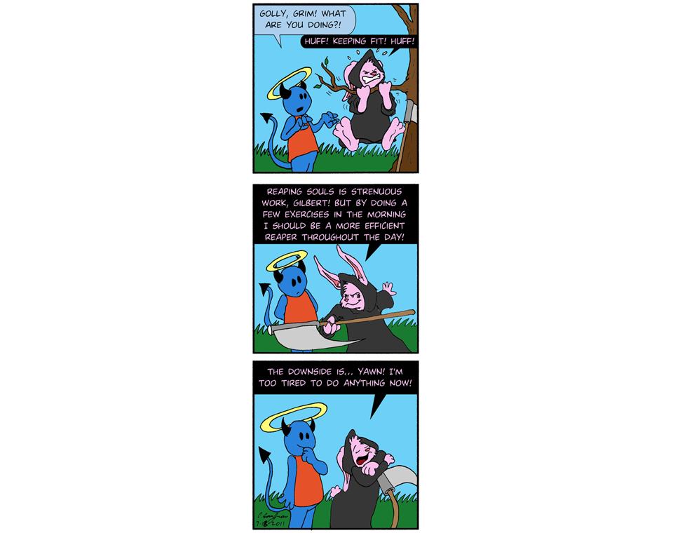
This comic likes to juggle its storylines while also having a gag-a-day feel. It’s mainly an episodic comedy following whatever happenstance falls upon the characters. There are little story arcs interspersed with longer ones, but the best plot summary is “characters talk and snark about the things they deal with on a daily basis”. That isn’t really a bad thing. As I will explain later, I find the writing to be stronger than the other aspects of this comic, but I do feel like it meanders a lot. The pacing feels slow and I found myself skimming some pages just to get to the point. The best parts of the plot are usually the ones who follow Grim, a pink Grim Reaper rabbit with a sarcastic streak, since she’s pretty good at being both the straight man and the funny man in any given scene. Whenever she appears (and she frequently does), she steals the show, but that’s to be expected—she is part of the title, after all!
3/5
Characters:
The cast is pretty big, as expected for slice-of-life. The characters who stood out to me were Gilbert, Thalia, and Grim. I found them to be fairly likable for their own unique reasons; Gilbert is endearingly naïve and upbeat. Thalia has a lovable yet no-nonsense personality and has some funny moments when that no-nonsense side comes out. Grim is delightfully snarky. She’s also the Grim Reaper. Scratch that, she’s one of many Grim Reapers, working for a silly bureaucratic organization alongside other Grim Reapers, including the eccentric Mimi. I found these two characters to be pretty good foils for each other and the strips that focused on their banter were kind of fun to read.
Although these characters are just a small part of the cast, I found myself enjoying the strips that focused on them more than the others. Sadly, I can’t really say much for the rest of the characters. Most of them just feel like extras to me and they don’t really stand out. That’s a really unfortunate flaw for a comic that’s supposed to be character-driven.
2.5/5
Dialogue:
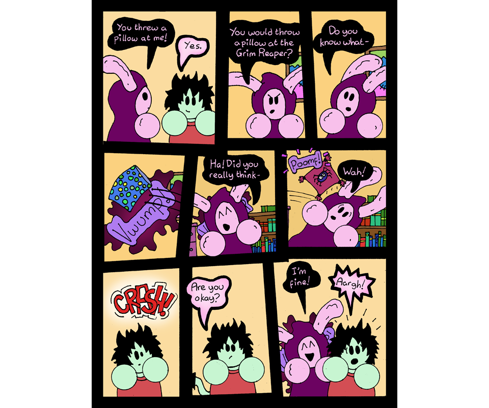
Dialogue was the part of the comic I felt was the strongest. The writer is good at writing snark and there are plenty of amusing moments centered around the simple verbal jousting between characters. None of the comics made me laugh, but I did find myself cracking a smile a couple times. I would give it more points if the art complimented the funny lines, but most of them time, it actually held it back. I’ll explain more about that later.
3.5/5
Lettering:
Right on the heels of the dialog, which I find the strongest part of the writing, we have lettering, which I find to be the strongest thing about the art. The lettering is hand-written, but nice and legible, which fits the casual, light-heated tone the comic is going for. Everyone has a different color assigned to their word balloons, which mirrors the palette of their character design. I like this idea for two reasons; first, it gives a little more personality to the speech, and second, it makes it easier to tell who’s speaking at a glance. Given the confusing composition of most of the pages, this is very fortunate. I doubt I’d be able to tell who’s speaking otherwise. Having said that, even if I see the lettering largely as making up for the compositional flaws, I still like the stylistic choice in general.
3/5
Art:
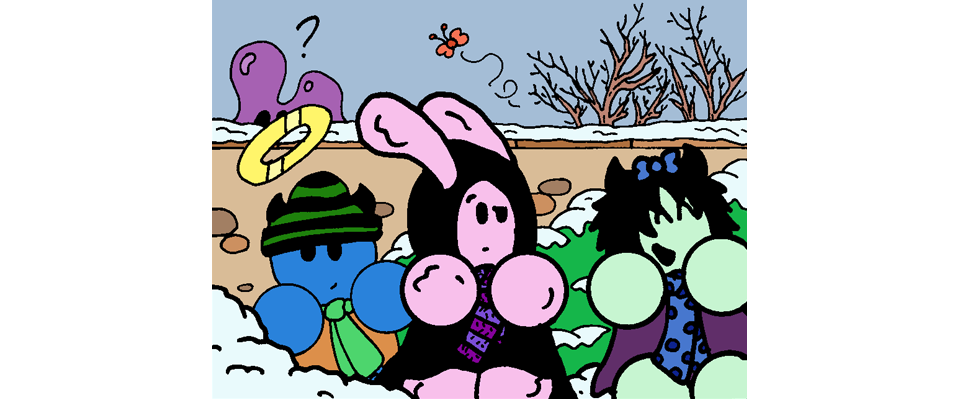
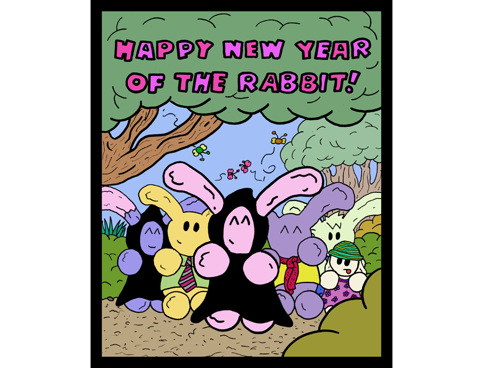
I don’t care much for the art. The character designs are overly simplistic with generic expressions and lumpy orbs for limbs. They look like overstuffed dolls and are just visually very forgettable overall. With the exception of Grim, I found myself immediately forgetting what most of the cast looked like as soon as I left the comic. That might sound harsh, but that’s the honest truth. The writing has sass and personality, but the art has no presence. However, I don’t think the artist isn’t trying to make the pages interesting. Although I find the style unmemorable and boring, I did note that most pages have full backgrounds and quite a bit of detail given the simplicity of the style. The execution of the art looks amateurish, but it seems like the artist puts some real effort into this. However, in almost 400 pages, the art hasn’t really improved. It may be time to consider integrating some changes. Namely, I think less stiff and lumpy character designs would lend toward more interesting body language, and the sassy dialogue would be much better with some stronger facial expressions. Consider, for example, this guest comic, which has a simple style, but gives the characters more range of motion to work with.
As a side-note, one of the chapters did change things up with a more text-heavy style with abstract visuals. I found these to also be a tad boring to look at, but I appreciate the willingness to experiment.
2.5/5
Paneling and Visual Storytelling:
The paneling is about as bland as the rest of the art. My major issue with it is that sometimes it’s hard to tell what’s even going on. The characters are moving around, but I can barely tell what they’re doing. The panel composition itself is fine. It’s what’s in the panels that’s hard to follow and it’s a problem when I have to spend several seconds just to figure out what the denoted action is. That is a very serious problem that can really bog down the writing. Even when the action is literally narrated to the audience, it’s still kind of confusing.
1.5/5
Website:
The website design uses transparent topnav bars, which travel down with the page as you scroll. This is a huge pet peeve for me, because it obscures part of the page while you’re reading it. The navigation arrows have the same problem, and the comic doesn’t allow you to click the page to progress. You have to click the “next” arrow. The website does have workable archives separated into nice little chunks, which I appreciate, and there is a ton of extra content available all throughout the site. However, I just can’t abide by the awkward layout the actual comic pages suffer from. That scrolling issue is incredibly distracting and I never could stop noticing it.
2/5
Summary:
This comic is cute and harmless and would probably appeal most to somebody who likes slice-of-life with some fantasy thrown in. However, the pacing of the storylines is slow and the art is bland to look at. I couldn’t really get into this comic, I’m sorry to say. I believe slice-of-life fans will appreciate this more than any other audience, but I’ve seen this premise done before and better. This comic is a little below average, but it still chugs along doing its own thing and it can be charming at times. Give it a chance and decide for yourself whether this is your cup of tea.