The Review Daemon: Meiosis
Another requested review, this one on the sci-fi comic Meiosis, by author and artist (R)ed.
Synopsis:
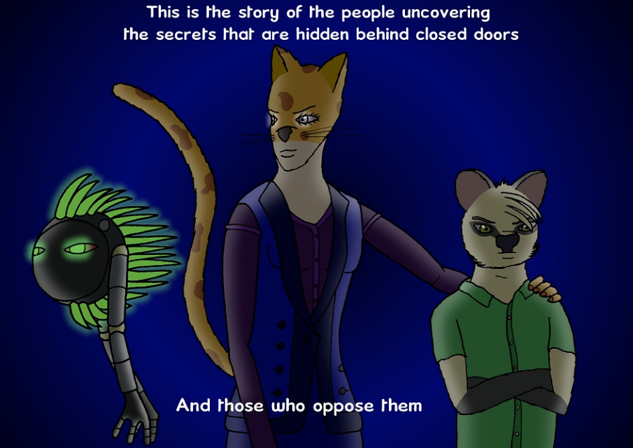
Meiosis is a gritty science fiction drama featuring anthropomorphic animal characters trying to uncover an epidemic of unethical genetic and cybernetic experimentation. It’s a serious and dark story with a lot of violent and gory imagery. It’s also a long-running comic that’s been around for about decade now. It’s also…very strange. In order to give this comic a fair review, I’m going to have to talk a lot about things that don’t have much to do with the comic itself. Don’t worry, I’ll still talk about the actual content, but it’ll need to be punctuated with some explanations. Such as…
My Attempt at an Explanation:
…the fact that this is a “rebooted” comic.
Sort of.
See, as I said, this is a long-running series that started back in 2006 and was mainly just a diversion for the creator. It chugged along and did its thing, but in 2015, the creator decided to start fresh while still leaving the old pages there to access for anybody who wants to read them.
I don’t recommend doing that. Just stick to the reboot. The old pages might give you some information about the story, but honestly I really couldn’t get into them. When your first story arc involves a bloody, violent shootout and I’m still bored, that’s a problem. Still, picking on flaws the creator is already aware of isn’t my style. With that out of the way, be aware that anything I write from this point on will pertain to the reboot and only to the reboot.
derp/5
Plot:
The plot has some nifty ideas. The basic premise is that crisis has hit a year 20xx United Kingdom. Genetic experimentation and engineering has advanced greatly, but is also prone to horrific violations of ethics. Therefore, it’s necessary to have individuals investigate labs involved in this kind of work. The story begins with sea vessel being invaded by Asdrubal Smith. He boards the ship and briefs the captain on a plan to reclaim a previously-lost warzone.
Enter Catherine Murdock and Ben Flowers, the two agents currently investigating some sort of in-vitro/cloning clinic. After discussing the nature of their visit to the head doctor, they’re taken to the laboratory, whey they witness the frankly gruesome results of the clinic’s work. And…that’s where it ends for now. The second chapter is better than the first, I’d say. Either way, it’s definitely going somewhere, but it’s still unclear exactly what the point of the story is beyond a lot of hints at conspiracies, musing about ethics, and smatterings of shock value (which isn’t very shocking at all given the uninspired art style, but this isn’t the art section, now, is it?).
It’s got a decent hook. I give it props for tackling some potentially rich subject matter, too. But the plot is really held back by the dialogue and art. I like the ideas here, but they’re undermined by the execution.
3.5/5
Characters:
Despite not appearing until the second chapter of the reboot, Catherine Murdock and Ben Flowers stood out to me more than anyone. The characters clearly have a history together. The older strips confirm that, but you don’t need to read those to get the vibe that they’ve worked together for a long while and know each other well. They make decent foils, too. Catherine is the more hot-headed one, while Ben is a bit more cautious. Interestingly, though, while
Catherine comes across as the gung-ho, hot-tempered one, she’s also way more jaded than Ben, who seems more on the sensitive, idealistic side. While waiting for the lab doctor to arrive, Cat is loud and mouthy, while Ben is calm and a bit sarcastic. However, when they witness the grotesque results of the genetic manipulation, Ben is clearly more shocked and outspoken against it than her. It’s nice to see a foil pair that plays off each other differently based on the situation.
Unfortunately, the rest of the cast is…not quite so interesting. It seems like Asdrubal Smith is supposed to be a primary character and he plays a major part in chapter one, but he doesn’t have much personality. In fact, none of the characters in chapter one stood out much. Chapter two is definitely a step-up in the character-writing department.
2.5/5
Dialogue:
Oh, the dialogue. This comic isn’t written in English, it’s written in Expositionese. The characters rarely ever speak conversationally. It’s always exposition on a plot point, explaining something about the setting, or outright technobabble. I know it’s early in the story and things need to be established, but this feels more like leafing through a worldbuilding bible than reading an actual story. When it’s not rife with technobabble, it’s just bland. A bit of sarcasm sneaks in sometimes, but it’s none too memorable…
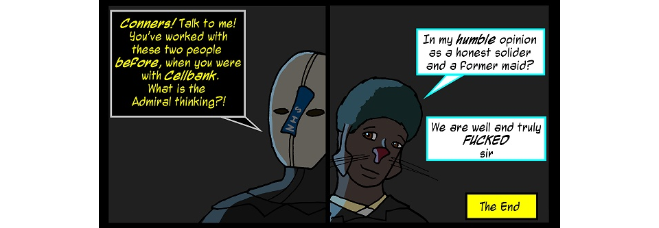
A setup like that could’ve had a much better punchline. Not to mention the question “What is the Admiral thinking?!” wasn’t even answered. Come on, now. Maybe I’ve been spoiled by comics that really know how to pile on the snark, but this one doesn’t have that magic touch.
The biggest offender is when I see what should be an important scene meant to leave a big impact and I end up skimming the dialogue for the gist. For example, this page (NSFW!!). This page is brutal (in theory; see the art section) once you realize what’s going on. But the dialogue is so straight-to-the-point and disaffected. Perhaps that was intentional, to show a lack of empathy or a coldly clinical attitude. I’d buy it, if only dialogue like that wasn’t already so commonplace throughout the comic.
Basically, the dialogue is big setback—in fact, the biggest setback in this comic. There’s too much monologuing and it’s not much fun to read. My advice? Take it easy on the techno-speak and stop making characters speak Expositionese all the time. Let the dialogue have a little breathing room before you lay down more plot explanations.
2/5
Lettering:
The font choices are pretty good. The main font is a standard comic font and gets different color treatments depending on who’s talking. I like it when characters get different colors or word bubble designs. It gives their dialogue a little more personality. Dialogue spoken via computer gets a more digital-looking font as well. The only thing that bugs me is the word bubbles themselves are incredibly inconsistent. Sometimes they’re squares. Sometimes they’re see-through. Sometimes they’re not even there at all and all you get is a disembodied tail. I like seeing variety with lettering, but this seems to have no rhyme or reason to it.
3/5
Art:
I really don’t like the idea of these cartoony, anthropomorphic creatures being in this super-gritty, Doom-levels-of-gore comic. There’s just such a disconnect between the character designs and the violent, graphic imagery this comic tries to employ. I say “tries”, because the art is so flat that things that should be shocking to look at end up seeming nondescript. For example, this…
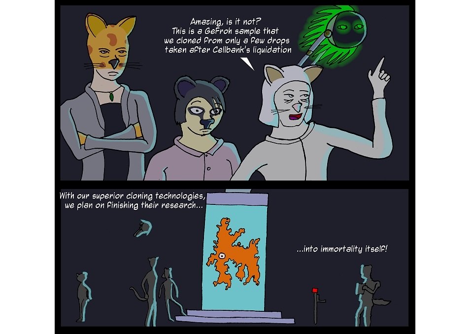
…is meant to depict the grotesque results of a half-developed genetic experiment. But more than anything, that orange splat in the second panel reminds me of this:

The other problem I have with the art is the characters’ faces don’t look so much like animals as they do human-shaped faces with animal noses painted on them. I’m not even sure what some of them are supposed to me. The three characters in that top panel, if I had to guess, are probably a cheetah, a koala, and a white cat, but I wouldn’t bet money on it. Honestly, I think it would benefit the tone of the comic if the characters were even more animal-like, with more realistic skull shapes and postures. The way they look now is just too cartoony.
This page is pretty dope, though. I dig the lighting, color choices, and effects here. More stuff like this, please.
2/5
Paneling and Visual Storytelling:
The paneling is a little plain. It’s always squares. Some pages change things up with different layouts or single-panel splash pages, but a lot of them are just rectangular three-panel strips. There doesn’t seem to be much consistency even then, since other pages will be vertical instead or horizontal for no clear reason. Variety is good, but as with the dialogue, there seems to not be any purpose to these choices.
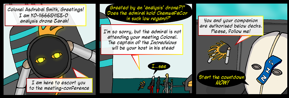
My biggest issue with the visual storytelling, though, is sometimes it’s hard to tell what I’m even looking at. The close-up shots are the worst offenders. Just look at this page. What’s going on here? The angles are weird and disorienting. Many pages have panels like these, but this strip is something else.
2/5
Website:
The website works okay, but it’s a little plain. While it’s good to have a page that’s not full of distracting clutter, the site design here comes across as…stark. Just an empty black background. It’s also stark information-wise. The cast page, for example, is useless. It’s just a bunch of pictures that cut off part of the characters’ faces and doesn’t even list everyone. It also has no bio information. The point of a cast page is to summarize who is in the story. The Gallery (NSFW) and Links pages also have very little content and the About page, while concise in summarizing the concept, doesn’t really say much. However, the archives are pretty good. Since this is a long-running comic, it lists all the pages and recommends where to start for those who want to skip some of the old stuff and there’s a “tag page” button under each page, so you can save where you were at and return later. Very useful for binge readers.
Overall, I think the site needs an upgrade in content, but there’s nothing seriously wrong with it, either. It does its job fine.
3/5
Summary:
There’s a lot of room to improve with this one. It wants to be serious, but the clumsy art doesn’t do the storytelling any favors. The overabundant technobabble and Expositionese is a chore to read. To be fair to the creator, though, I can see that the comic has improved. Although I’ve decided not to harp on the old pages, some credit is due here for the fact that the new stuff is better. I’m not all that impressed by it, but it’s definitely an improvement.
If you want to read this, I recommend you do as the comic maker suggests and start with An Actual Introduction, which R(ed) considers a “soft reboot”. If you enjoy that, you can go back and read the old pages, but aside from wringing some (more) exposition out of them, they’re probably not going to do much for you. The reboot shows some of the best the comic has to offer.