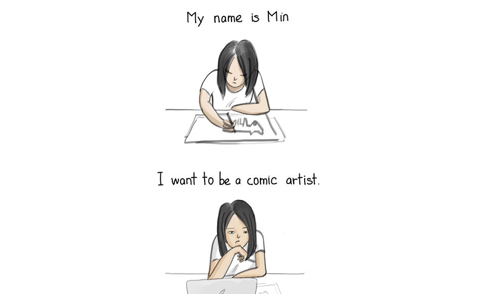
The Review Daemon: Min’s Struggles
Woohoo, new review!
Today’s requested crit review is on Min’s Struggles, by Min Roh. We’re finally catching up on our backlog, so good thing I just opened it up and added another 20 or so 😉
I’ve been enjoying having guest reviewers for different perspectives, so let me know if that’s something that you’ dbe interested in doing too XD
Synopsis:
Min’s Struggles is a simple memoir-style comic about an artist and her, well, daily struggles. What with, exactly? Mostly with personal problems or art. Some of the strips are all about how the creator, Min Roh, overcame a bout of artist’s block, followed with a tutorial showing how to draw the subject she had trouble with. So, in this case, the target audience seems pretty clear. This is a comic written by, about, and for artists, and it’s meant to be relatable. Let’s see how well she does that.
Writing:
This comic is a series of strips about the main character’s daily life and the things she deals with. Sometimes it’s about heavy philosophical musings, and other times it’s a cute or amusing moment. A lot of the writing is centered around her art, dealing with personal hang-ups and emotional issues, or building relationships with others. The most common strips you’ll see are:
Art tutorials or advice
Pencil and eraser strips
Personal reflections
General angst about life or art
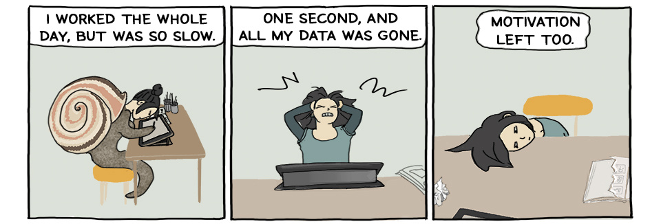
And those samples I put above? Well, if you liked that, you can expect more of the same from the comic as a whole. If none of those really grab you, though, this one might not be for you. For my part, I do enjoy a lot of these, but the audience seems limited mainly to artist-types.
3.5/5
Characters:
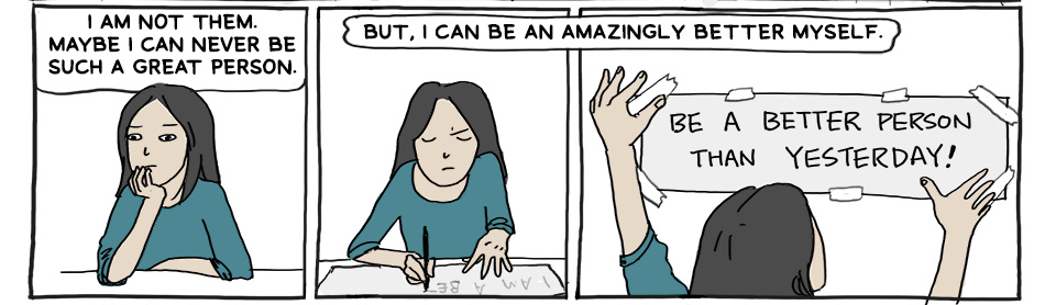
It’s always difficult to talk about this when it comes to memoir-style comics. The human characters in this comic are direct representations of the author and the people in her life. I don’t know her well enough to say if the representations are accurate, and I’m hesitant to judge the writing of the characters as if they are an entity unto themselves, because I know full well I am indirectly judging real people.
So I will say only this—I find the author’s musings relatable and fairly interesting, if sometimes tending toward repeating the same ideas multiple times. I don’t mind that she likes to explore the same themes, but I find some more engaging than others. For my part, I like the tutorial strips the most, and I think a lot of fellow artists would also find them useful and interesting.
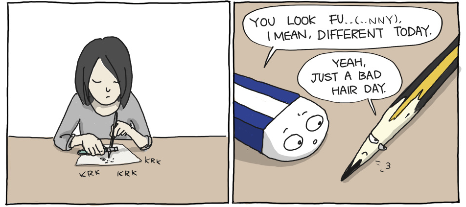
Now for the characters I do feel safe in critiquing, the pencil and the eraser. These two are depicted as friendly rivals who help the author get her work done. Their strips are usually light-hearted and have a lot of meta-humor about art. For me, at least, it never gets old. Those two could probably carry a webcomic all on their own, but they do a good job at being supporting characters to the human cast.
4.5/5
Dialogue:
The comic struggles with grammar issues that make the dialogue come out sounding awkward. That’s a bit of a problem for a comic that focuses a lot of conversation. However, I really don’t want to be overly harsh on this issue, because the author’s first language isn’t English. It’s a bit unfair to criticize awkward dialogue knowing that, but it’s still a flaw the webcomic has regardless.
On the other hand, although the writing has grammar problems, the ideas conveyed can be pretty insightful. I like the conversations between the pencil and the eraser. Sometimes the human characters breach the fourth wall a bit too much, and the comic goes from a conversation about something meaningful to the characters trying to deliver a nugget of wisdom to the audience. This has mixed results. In some cases, like the art tutorials, it’s interesting and useful. Other times, it comes across as a bit PSA-ish. The conversations between the pencil and eraser, though, are more organic and can be casual and fun just as much as they can be insightful.
3/5
Lettering:
The lettering isn’t anything much. It’s just your usual fare when it comes to individual strips like this. The font is nice and simple. The word bubbles appear to be done by hand, and they’re a little wobbly. There isn’t much else to say about it. The lettering does its job and that’s that.
3/5
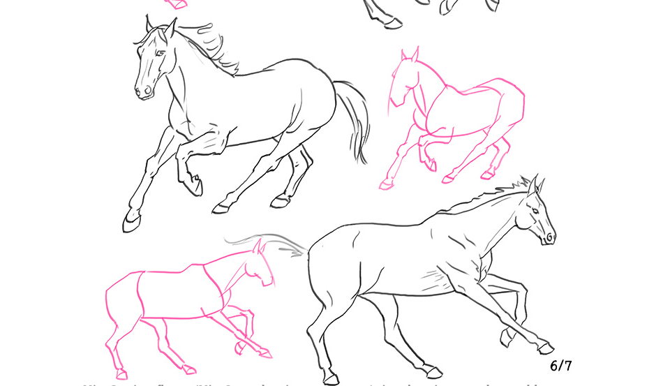
Art:
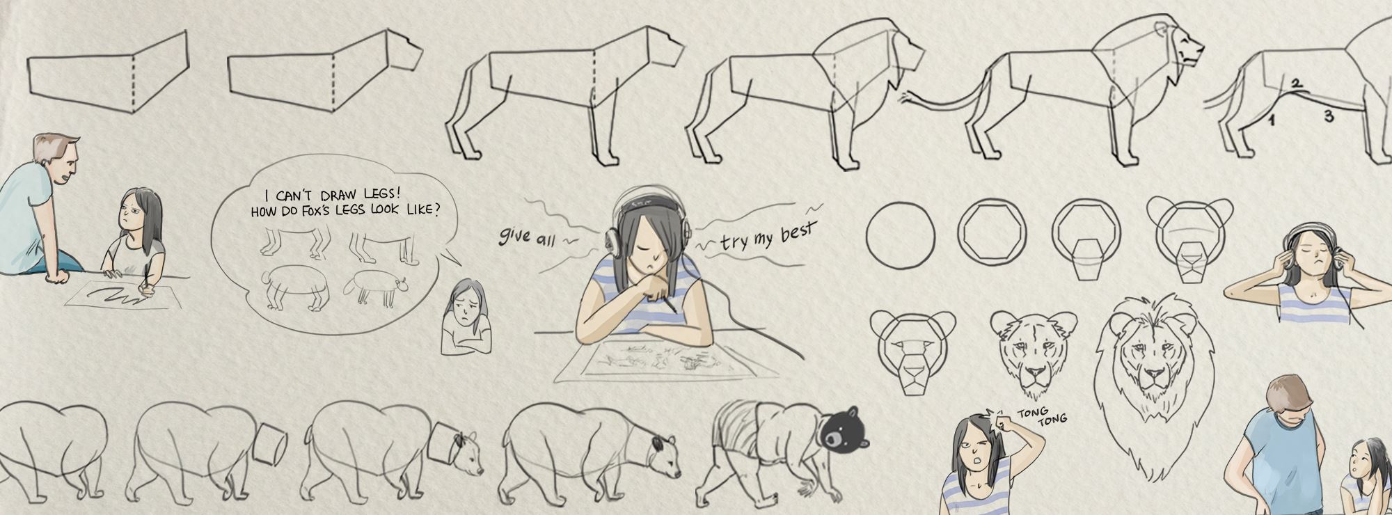
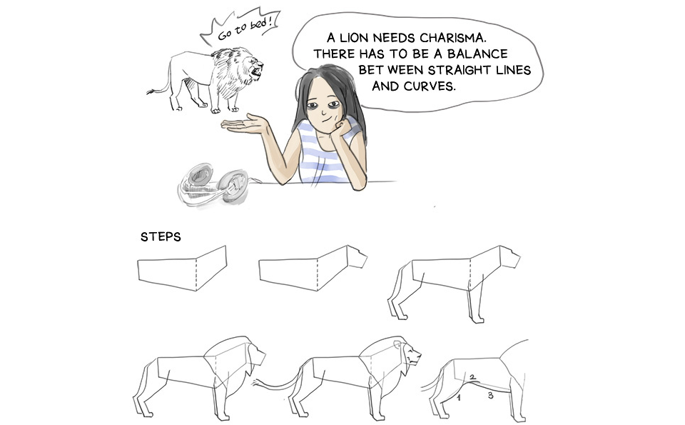
For a comic about art, I can’t say that the art is really impressive in most strips. The creator has skill—the tutorials show she understands anatomy and dynamics, and when she puts the time into it, her drawings are very good. That’s probably why I appreciate the tutorials so much. It’s in those strips that her art shines the brightest. Just look at these angles in the horse strip!
Unfortunately, that aside, I find I like her old art better than the later art. Overall, it seemed a little more creative and “alive”. I’ll show a side-by-side comparison to give you an idea of why.
This is the very first strip. Though simple and lacking a background, notice how the artist uses soft lines and shading on the figure. The colors are limited, but the texture and blending techniques keep them from looking flat and the poses look natural and fluid. It’s not perfect, but it does have a lifelike feel.
This is from one of her more recent strips (as of the writing of this review). The lines are darker, but a lot less smooth and the poses and colors both look static by comparison. The only use of shading doesn’t add much. This doesn’t even look like the same person drew it. The creator has shown she can clearly draw better than this, and not just in the tutorial strips. Granted, not every strip is going to be amazing. That’s fine, perfection is overrated. But it would be welcome to see some of the better qualities of the early art return.
3/5
Paneling & Visual Storytelling:
Much like the lettering, the paneling is pretty utilitarian. That’s typical of these kinds of comics and it works fine. However, as with the art, it seems like the author makes more creative choices every so often. The more basic strips, where all the panels are squares, look okay. But it would still be nice to see some bolder ideas with the paneling in the future.
As for the visual storytelling, the creator does use a lot of different angles, so even though the composition of the page as a whole is grid-like, the drawings in the panels show variety. The art quality seems to have declined somewhat, but the composition of the art has not; if anything, that’s gotten better over time. More backgrounds, lots of angles, and interesting poses. That’s something I can appreciate.
3.5/5
Website:
The comic doesn’t appear to have one specific, dedicated website. The link we got open request was for the Facebook archives, but Facebook isn’t really a great platform for most webcomics. I did a little digging and found that Min’s Struggles is hosted several platforms, including Instagram, Twitter, Tumblr, Pinterest, and Medium. However, none of these are dedicated webcomic sites, so the archives are…not great. The closest thing to a dedicated website for her comic she has is Tapastic, and that’s the one I suggest checking out if you want to read all the strips at once.
I’ll give the comic some credit here. It takes a lot of time and effort to maintain so many different social media extensions, and the creator keeps them up to date. I’d prefer that the comic had a main website, but I realize not everyone has the time or know-how for that.
3.5/5
Summary:
I like the ideas this comic puts out and while I prefer webcomics to be on either a hosting site or their own site, there’s something to be said about the accessibility of using multiple accounts. However, I really would like to see the art regain some of its former vitality. Min Roh has the skill and talent to put out some really good work, but it doesn’t come through as much as it could. As far as relatability goes, though, I think most artists—especially indie artists—will see a little of themselves in her, and I think most people could come away from the comic having learned something. Check it out for yourself and see what you take from it.