The Review Daemon: Reckstar
Today I’m reviewing Reckstar, a humorous sci-fi space opera, with story by Joey Cruz and art by Michelle Nguyen. I enjoyed the new format and focus I started last time, so I’m going to be writing this again as mostly a critical review for the creators, to hopefully help them improve their comic. So while I’ll try, I’m not going to avoid what could be termed spoilers, in order to give them the best feedback I can.
Synopsis:
Reckstar takes place in a far distant future, where intergalactic travel is common and the universe thrives on interspecies trade. Unfortunately for mankind, we’re the red-headed stepchildren trailer trash that no one else really likes, and have been for centuries.
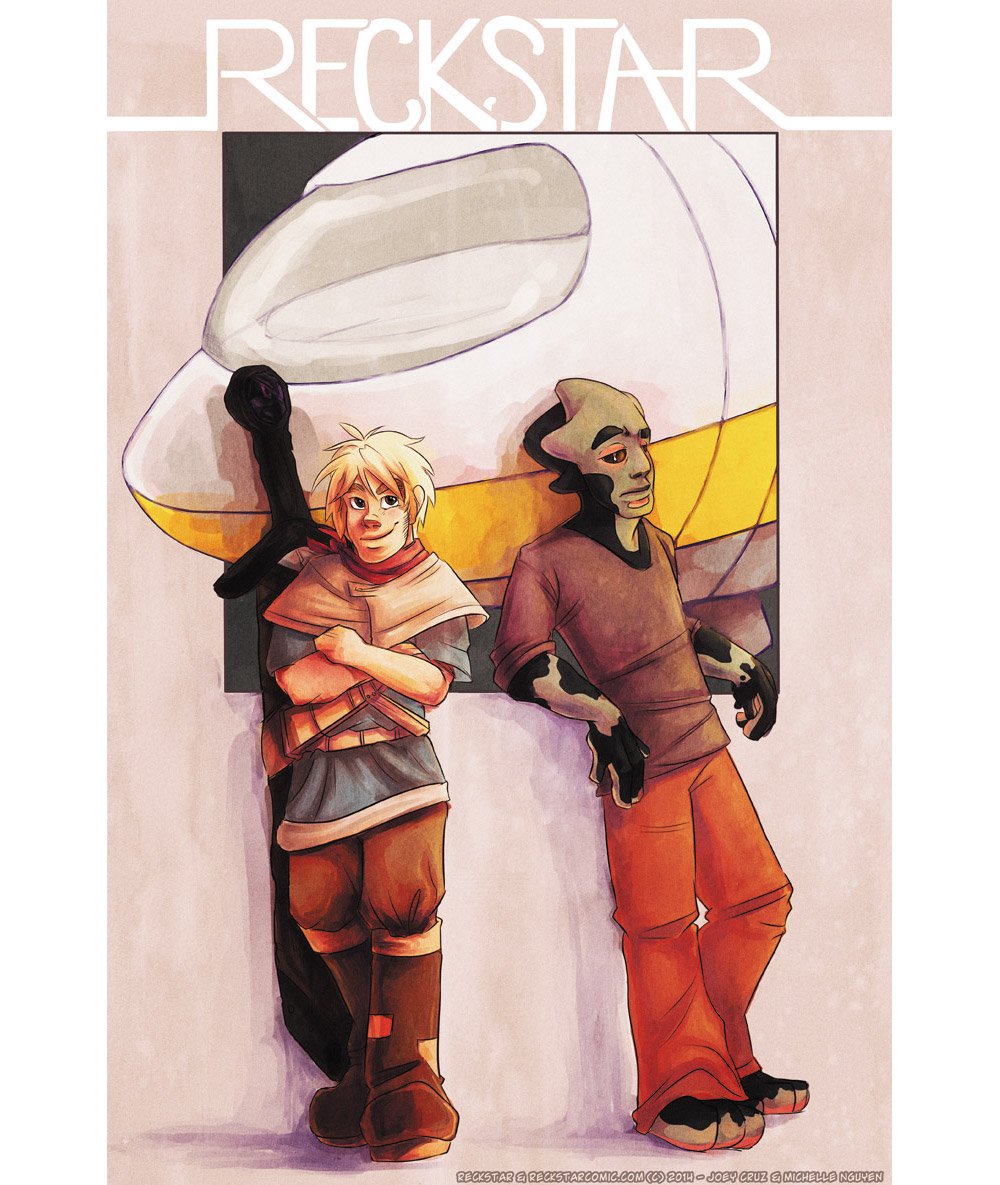
The comic follows our the adventures of our two independent space-delivery-boy protagonists, Thade Reckstar and Finn Wyoming. Thade is a Malarian, and obviously the brains of the operation. Finn is human, and brings… naivete and an unfounded sense of heroism? Thade keeps him around for some reason, despite Finn’s penchant for getting the pair into trouble as they seek gainful employment.
Plot:
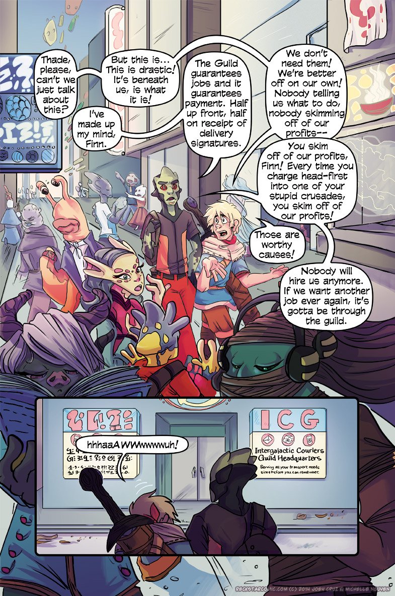
The comic starts out as Finn inevitably causes problems for the delivery duo, this time over a grave misunderstanding over how alien physiology and sociology works. After a string of blunders makes clients wary (and weary) of hiring them, Thade applies for membership to a shipping guild. Worried about their reputation, the guild gives them a job as a trial run. As you might expect, the job runs into some unexpected difficulties, and it looks like Team Reckstar may be in for more than the simple delivery job they signed up for.
While only two chapters in, Reckstar already has me hooked on the story. While not necessarily that original, it has all the elements of a good story, and a good pacing to the plot, introducing characters and worldbuilding at a natural, easy to follow pace while simultaneous advancing the plot with good action and concise dialogue. The plot is, however, a little formulaic and predictable at the moment. This may just be because with only two chapters in, Cruz is still mostly setting up the scene, and as the story continues it will bring in more original elements. But since the story so far has been told well, I’m hopeful that it will, and definitely willing to give it the benefit of the doubt so far.
4/5
Characters:
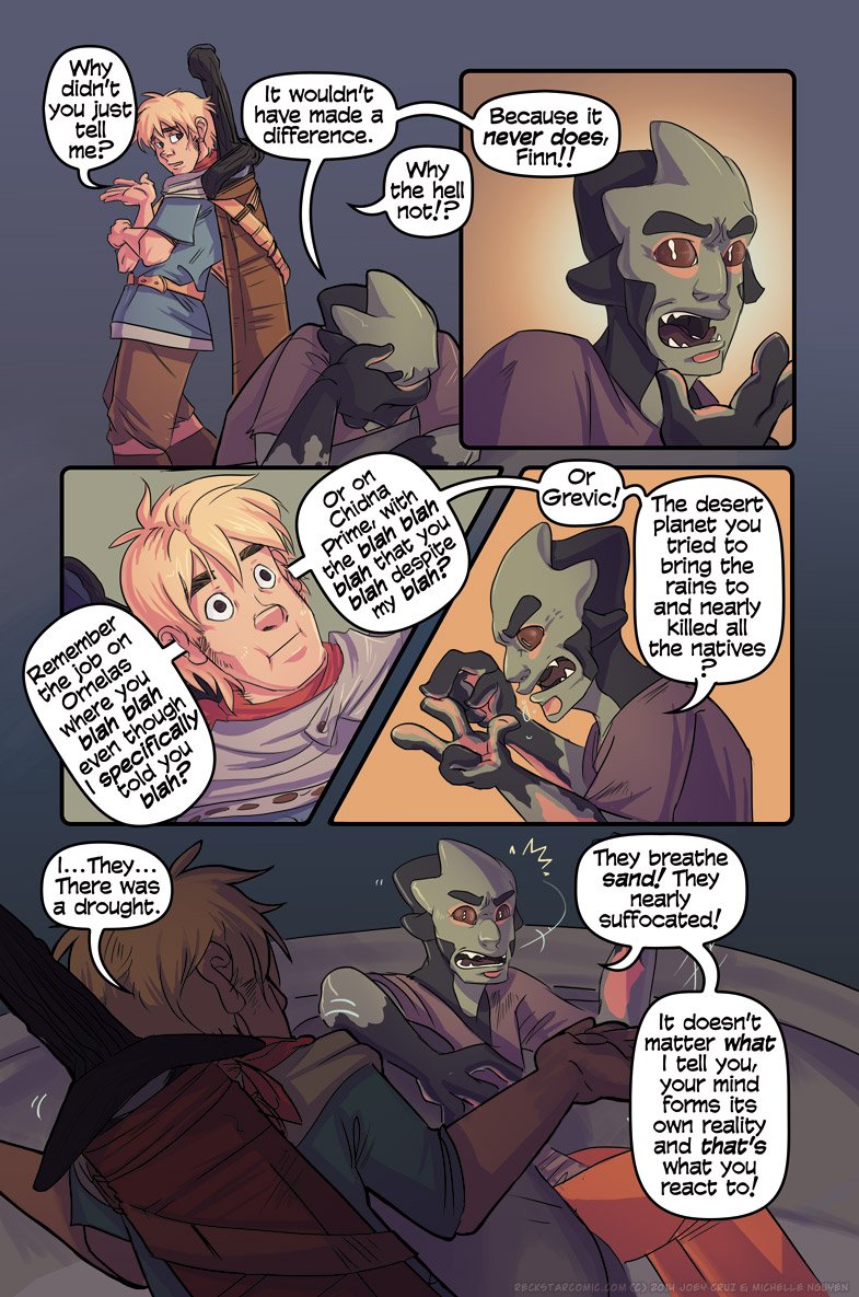
Cruz and Nguyen have gone a very good job developing the characters of Reckstar. By just page 4 we already have a very clear idea of who these characters are without having to explain too much about them.
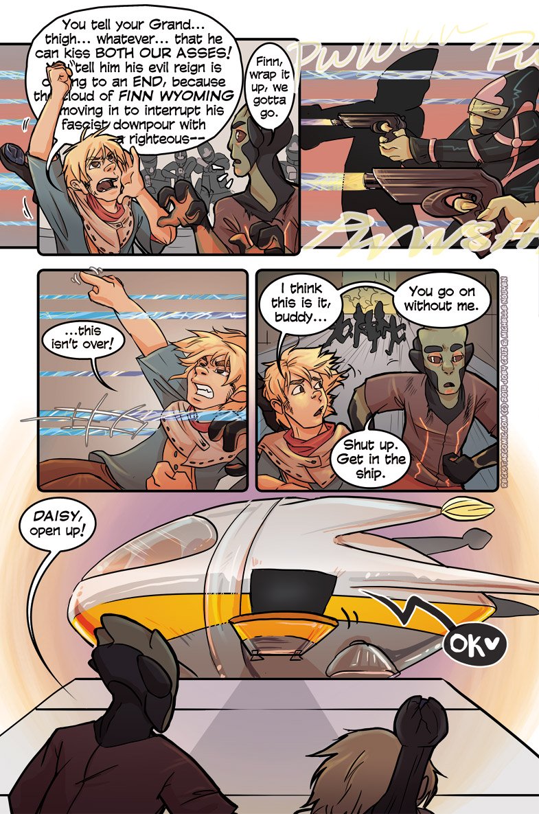
Just with these simple lines of dialogue and visual storytelling, we can tell so much about not only Thade and Finn, but even their spaceship Daisy. Thade is serious, and a little fed up with Finn’s crap. Finn is an idealist with a HUGE flair for drama, and carries a sword with a cracked hilt (nostalgia, mayhaps?). Daisy speaks like a giddy child with HEARTS in her dialogue. This is EXCELLENT characterization.
And it doesn’t stop with our main protagonists. Even characters only present for a single page get developed well.
Beautifully done. Essentially all characters who get introduced receive similar treatment, with depth and backstories, interesting quirks and room to grow.
5/5
Dialogue:
As I’ve already mentioned, Cruz does a good job using concise but flavorfully informative dialogue that tells us more by HOW the characters say things than WHAT they say.
I’m going thru each page looking for examples of good (or bad dialogue), but I’m having a hard time picking a page to share because each page’s dialogue is just so well done.
…
Yup, can’t find anything that sticks out as bad, and finding MANY good examples. Here, have another one.
I don’t have anything else to say about the dialogue except “Bravo, good sir.”
5/5
Lettering:
I’m not sure who does the lettering (probably Nguyen?) but is is also done well. They’ve picked a good font, space the dialogue evenly inside the speech balloons and far enough from the borders, use sans-serif capital I’s, everything even I as a non-letterer know are the good things you’re supposed to do. They’re also careful with their balloon placement, avoiding crossing tails and helping even complicated pages of dialogue be legible.
It’s not perfect (some of those balloons’ placements makes the order still a little vague for me, for example the first 3), but it is on average excellently done.
On top of that, they even do some creative things with the lettering at times, like using the size and shape of the speech balloons to convey meaning. And occasionally using the magic of animation available to digital webcomics to give their pages a little extra flavor. The gif file is a little too large for me to post, so go check it out on their site. Basically, in one instance where Finn is babbling an overly long sentence, they have it loop with scrolling dialogue inside of his speech balloon. Very creative and well done.
4.5/5
Art:
Nguyen does a simply beautiful job with the art, as you’ve already seen. Professional and consistently high quality from page to page. She has a good grasp of anatomy (human AND alien) and posing, and an eye for detail, working little clues (like Finn’s sword having a cracked handle) in that add an enjoyable depth to the pages. Linework, shading, flatting, color; it’s all excellent, as you can see on this page:
Really, quite excellent, and I can find no faults in it. It may not be fancily abstract and creative or whatever some people look for in art, but I like it. It’s clean, pleasant to look it, and tells the story very well (but more on that in the next section).
On occasion, characters faces will look more different from one panel to the next than I personally feel is warranted just by having creative fun with expressions and whatnot. But I’m picking at straws because it’s really quite good.
4.5/5
Panelling and Visual Storytelling:
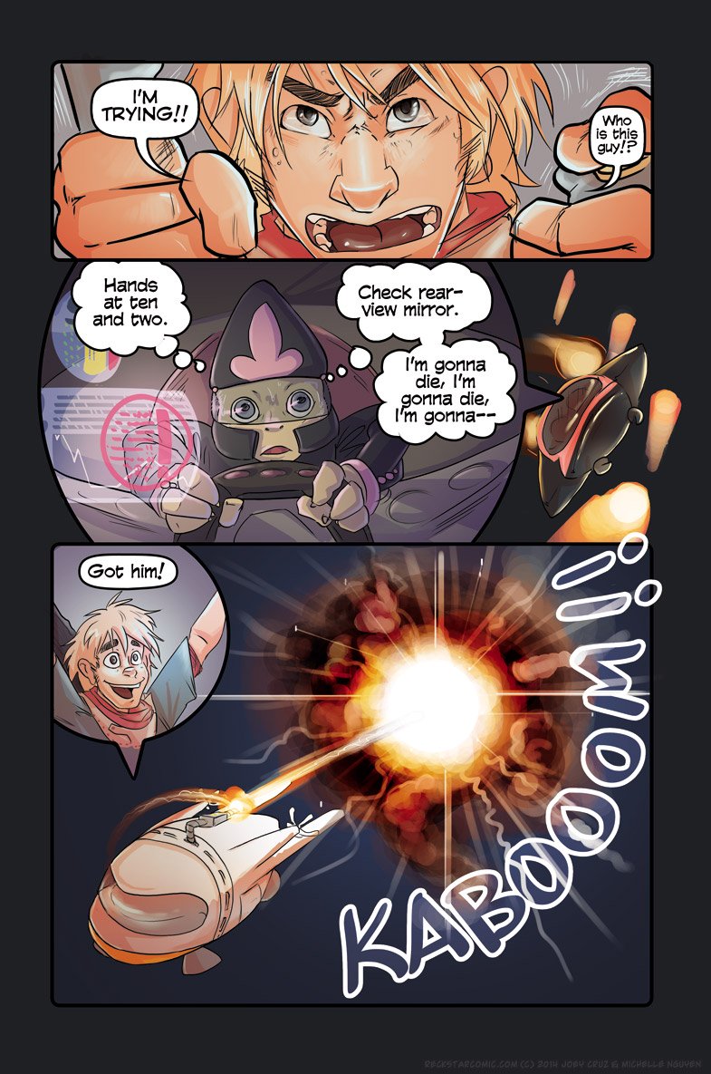
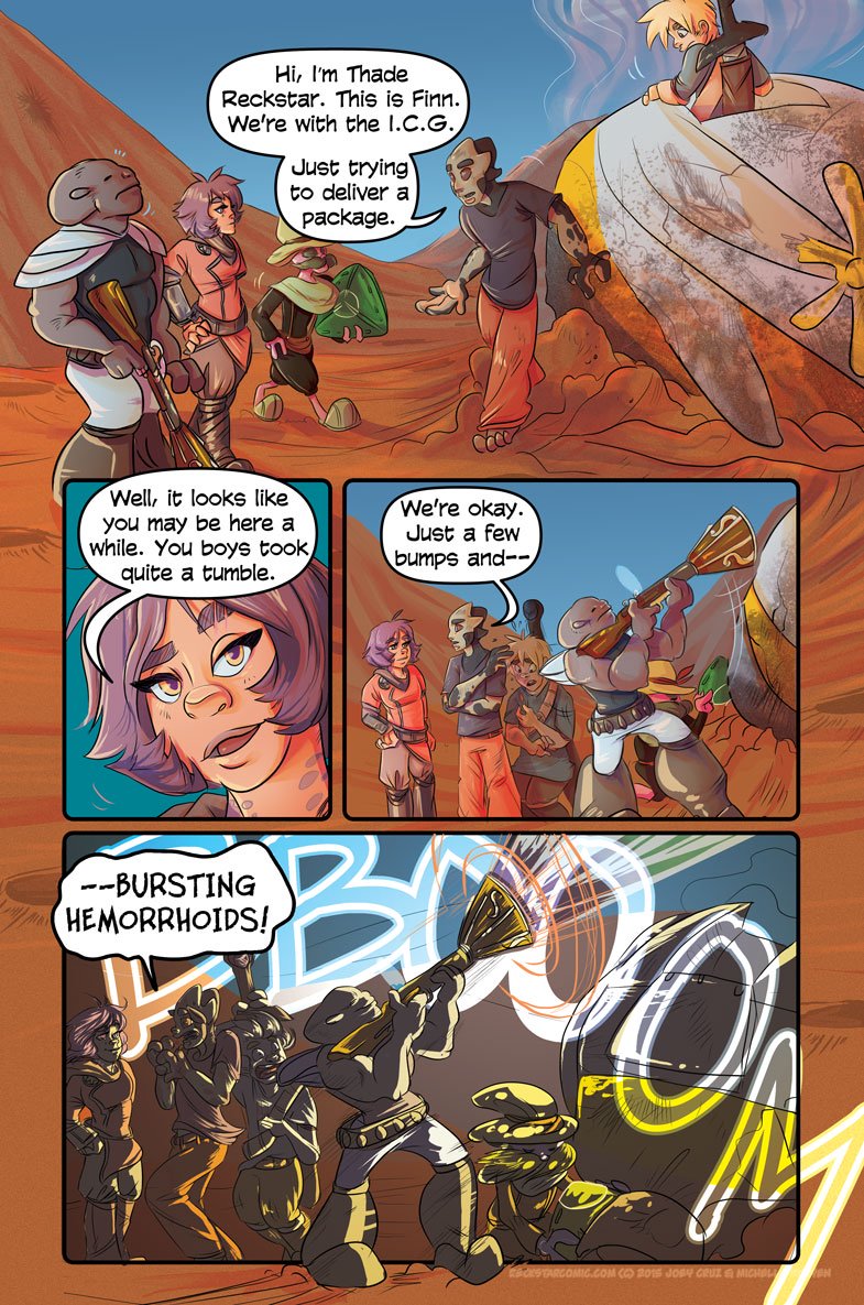
Not only is the art technically competent, but Nguyen uses it with great precision to tell the story, panel by panel. Such as how in the previous page I shared in the above section, everything that happens in later panels (and pages) is set up and shown in the background of each panel before. The guy with the gun looks up and notices his target starting in the first panel. Captain Mustache with the green triangle (which on the next page we see emits a force field tow truck thingamabob, basically) is moving it into position each step of the way.
Tons of tiny details that you can see all come to fruition on the following page:
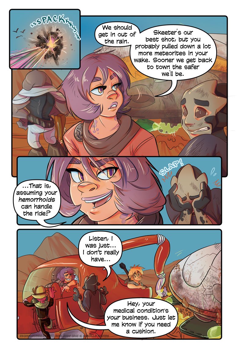
Again, the consistency of the quality in the comic is what is impressing me the most. Little significant visual details are constantly used to tell the story, and panels are placed in creative ways to help with that. I never felt confused or had to try to figure out what was going on in a panel, and often found that I could see a new awesome level of detail as I re-read.
5/5
Site:
With as awesome as the comic is, the site could use a lot of work. There isn’t a very functional archive, making it very difficult to search for a particular page. A nice simple list of the pages (which have descriptive titles each) all on one webpage would be much preferable to the multi-page layout with only a couple comic pages per webpage visible. If I have to click that much to find a particular page I may as well click back thru the entire archive.
I’d also suggest replacing the “Random” button under each comic page with a button linking to the Archive (new and improved, of course), or even a dropdown bar with a list of the pages or something.
The visual elements of the site up at the top and the menu are good, but down near the bottom it gets kind of hectic and cramped, with many links in sidebars and footers that are hard to follow. Some of that is just font color, other is design and placement choices. Overall, though, it could use a sprucing up by an experienced web designer. It looks like it’s running a lightly stylized ComicPress or something at the moment, and just doesn’t fit the rest of the quality of the comic.
2/5
Summary:
Reckstar was a very enjoyable read, and a fantastically done comic. I’m surprised I’ve never heard of it before, and I expect it to go places. I honestly would not be surprised to see it picked up by a collective or publishing company of some type. The writing and art or both excellent. The only real weaknesses are the simplicity of the site and the problems with update schedule that seem to plague the creative team. Hopefully you can get more attention and more funding from readers to help you produce more and more quickly, and not have to take such long hiatuses, because you have something very good going on here.
Plot: 4/5
Characters: 5/5
Dialogue: 5/5
Lettering: 4.5/5
Art: 4.5/5
Panelling: 5/5
Site: 2/5
Overall Rating: 4/5