The Review Daemon: Xylobone Tomes
And we’re back with another long-awaited webcomic review, on Maryanne Rose Papke’s comic Xylobone Tomes. Since she’s a fellow member of SpiderForest I decided to give her comic to one of my guest reviewers to recuse myself of bias, as I often do with comics by friends for these more critical style reviews. I’ll limit myself to making goofy captions for the photos. Purely because otherwise my site/theme stretches them out oddly, of course 😉
Synopsis:
Ever wonder what the daily life of an undead wizard is like? Xylobone Tomes gives us the answer, following the adventures of Saga and his faithful servant, a mandrake named Ariel. The comic is full of all your favorite fantasy creatures and character archetypes, told from the point of view of a type of character that doesn’t usually get to play the protagonist role.
And boy, has the world missed out, because it turns out the life of a Great Lich is one interesting ride.
Plot:
At about 130 pages now, the major plot is still piecing together. This comic starts out pretty simple, with Saga and Ariel going out on what should have been an ordinary errand. However, their attempts to teleport to their destination goes wrong and they end up someplace unexpected, where an infestation of nasty, leech-like beasts has been ongoing. After dealing with the problem and meeting some rather suspicious dwarves, Saga decides to probe further into what has been going on, making a personal visit to the fairy queen to get to the bottom of things.
Part of the charm of this comic is that even though the central conflict hasn’t fully developed yet, Saga is an interesting character. It’s fun to watch him solve smaller problems while he investigates. There’s clearly a large-scale conspiracy looming, but the slow build up to that has been full of fun and intriguing moments. It’s also punctuated with a lot of exposition too, however. It would be nice to see things happen more and have them directly related to the viewers less.
The one thing I would say is although this is a fantasy comic, it is not to be mistaken for the swords-and-sorcery genre, despite the similarities of the setting. This story is more on the intellectual side. The actions scenes aren’t the focus, the lore is—which is perfectly fitting for a comic with a protagonist like Saga. But viewers who expect excitement and a fast-paced story might not find this one too appealing. That doesn’t mean the comic is inferior for doing something different; if you’re wanting something different, this is a great place to look.
4/5
Characters:
Saga is by far the best character in the comic, which is a good thing considering he’s the main character. He’s practical, sarcastic, and witty. He’s also very powerful, but rather than using his considerable magic skills to bypass every roadblock, he’s just as liable to handle a problem intellectually. It’s equally entertaining to watch him fry some troublesome monsters with a giant magnifying lens as it is to watch him blackmail the fairy queen into letting him sit in on a meeting.
Ariel is also a pretty endearing character, despite not being able to speak. Ariel just has this innately endearing, faithful demeanor that makes for a great sidekick character. Sometimes you really don’t need much to make a character enjoyable, and Ariel is a great example of that.
The rest of the cast kind of fades into the background by comparison, however. While I like Saga and Ariel, I find myself less interested in pages following other members of the cast. With the exception of the fairy queen, Seffren, who is delightfully temperamental and snotty, I didn’t get much of a feel for their personalities. Some of them are mildly sassy, but can’t compare to Saga. Others are dry and serious, or just kind of…flat.
3.5/5
Dialogue:
The dialogue in this comic is sharp and witty, yet also poetic. It’s much like one would expect from a fantasy comic of this variety, but it avoids pushing the “archaic language” too far to the point that it sounds wooden. In addition, Saga’s snarky comebacks play fantastically off a cast of characters who are more often than not dead serious and don’t appreciate his sarcasm. However, not all of the dialogue is as fun to read.
Sometimes the exposition comes out a little dry. At times, it feels like it’s doing nothing more than getting the viewers up to speed. Part of the problem may lie in the fact that we don’t get to see many of these events, just their aftermath. Like I said before, it would be nice to see some of these things happen, instead of being told about them.
3.5/5
Lettering:
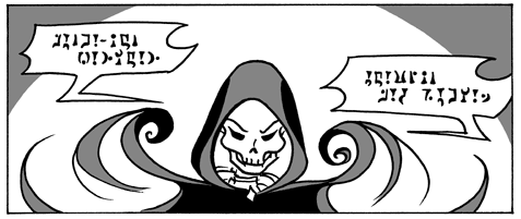
The lettering style fits perfectly with the art. The font has a handwritten quality to it, but it’s still neat and easy to read. For scenes where magic spells are being used, the lettering switches to indecipherable but interesting-looking runes.

The runes even vary depending on the type of magic being used.
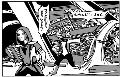
To complement the angular art style, the word bubbles have less of a rounded design and instead incorporate a mix of sharp edges and curves. The amount of sharp edges and curves even appears to vary between characters, changing shape to reflect their design. These sorts of subtle choices make the word bubbles match the art style and integrate them neatly into the pages.
5/5
Art:
The art is black, white, and greyscale with no blending. Occasionally, a page will use multiple layers of grey for more complex scenes, but sets them up in a cell-shading style. The simple and very basic nature of the shading works out for the best, because the inking is often profuse.
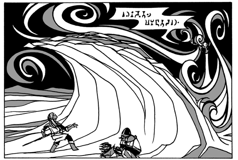
The style of the art is very pattern-oriented, creating a scene and landscape with simple repeating lines, curves, and spirals. Much of the art, as I mentioned before, is sharp and angular, almost gothic in its aesthetic style. The only major flaw is that some pages are so busy that it’s uncertain where the focal point is. I appreciate the level of detail the art brings, but sometimes it works against the panel as a whole, as this example below shows.

Along with that, I find the characters suffer from looking flat and static, especially the background characters. The anatomy sometimes looks oversimplified to a fault. I like the highly-stylized look of the comic in general despite these flaws, but a little improvement with the anatomy and more care given to avoid overly busy compositions would make it even better.
3.5/5
Paneling and Visual Storytelling:
For the most part, the paneling is pretty basic. It’s mostly just rectangular panels and it works fine with the art style, but it’s also nothing too remarkable. I do think the comic might benefit from just a bit more experimentation of techniques, like having objects reach out of a panel for emphasis, for example. There are times when the strictly closed nature of the paneling looks confining.

Having some of those magical effects reach outside of the panel would have made it look much more dramatic. The comic does use something along these lines on an earlier page and on another page much later, but there are plenty of other opportunities where experimentation might have been a good idea.
3/5
Website:
The website is very basic, but functional, with a black and gray color theme. It’s not much to look at, but it doesn’t look bad, either. I will say that I highly recommend reading the vignette comics in the Extras. But that aside, there isn’t much to say about the site design.
3/5
Summary:
Viewers who like stories with a more gradually-building, mysterious pace will probable appreciate Xylobone Tomes. The story is a little on the slow side and the action isn’t terribly exciting, but if you want something that takes a slightly different approach to world of fantasy and has a more cerebral nature, this is a good comic to check out.