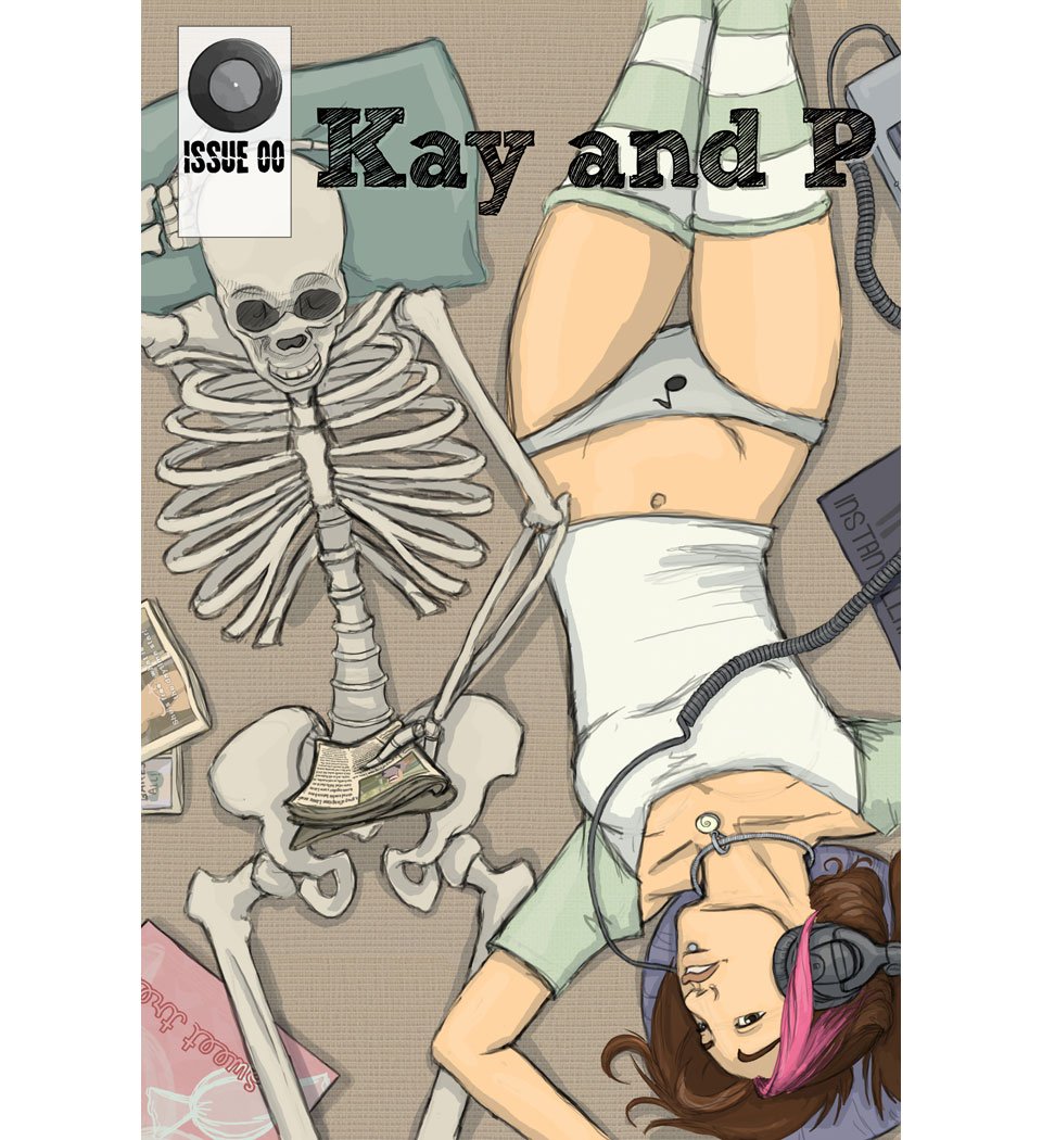
Why I Read: Kay and P
I also read this comic, but today’s “Why I Read” fan review is from guest reviewer Olivia Wylie, one of the creators of the webcomic Parmeshen.
This review originally appeared on Olivia’s review site, The Strip Show: A Webcomic Revue. She has graciously repurposed it to share here with all of yo uas well 🙂 Fair warning, Kay and P contains some non-graphic sex and nudity.
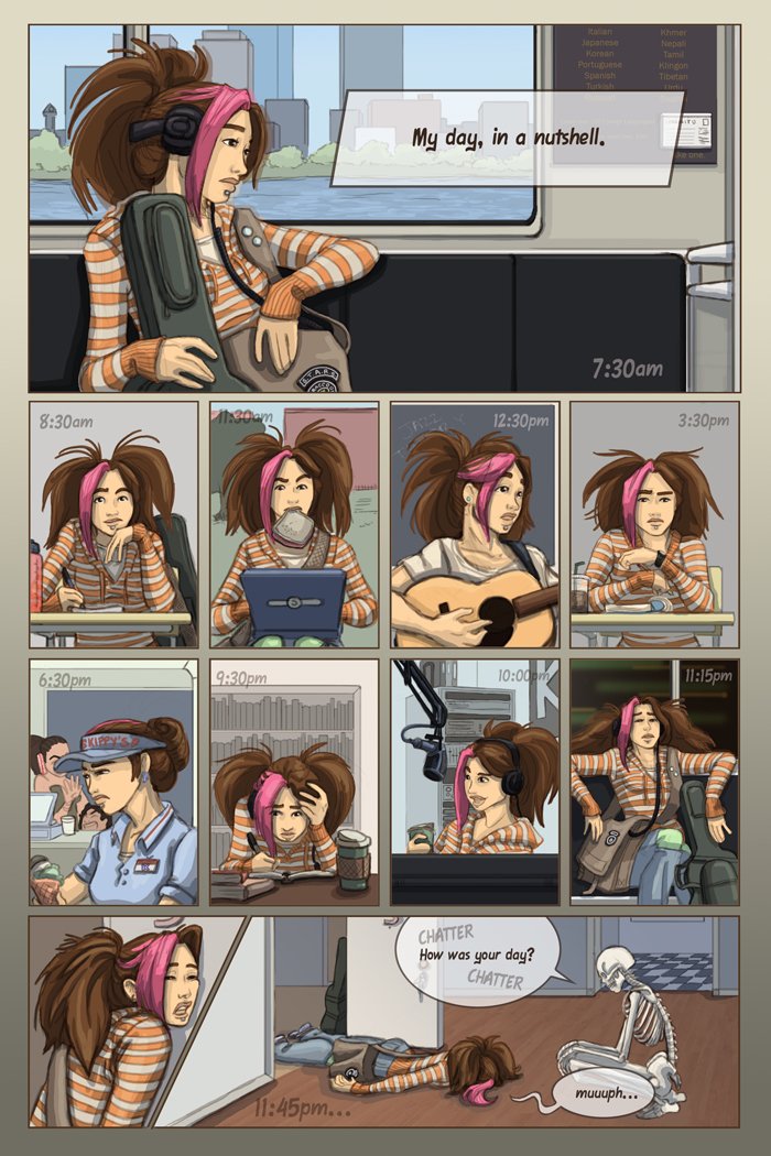
Have I got a treat for you, dear readers! Kay and P, written by Jackie Musto, is a gorgeous piece of work. It is a very special and unique animal; a wonderfully real and casual urban fantasy that you can actually believe in. Most of the time, it feels more like a really well done slice-of-life piece than a true urban fantasy….granted, a slice of a VERY interesting life. In fact, you wouldn’t be surprised if Kay moved into your apartment building, though you may or may not see her roommate P; it all depends on how much magic is in your blood!
Why I Love It:
For once, I’ll start my rave with the art. AKA, the art is just that good.
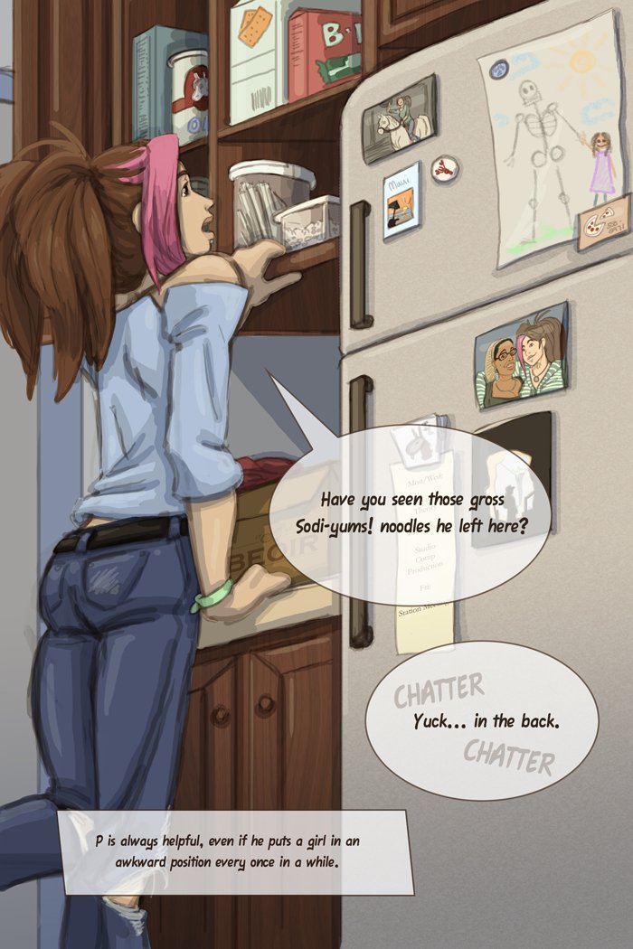
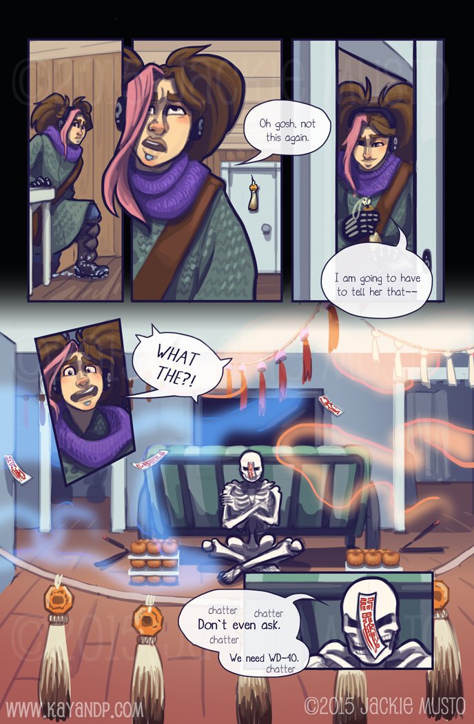
Even daily tasks look gorgeous when taken up by this comic’s style. It’s one of the best realistic comics I’ve seen, done in a gorgeous style that is at once evocative of a good photographer and a good pastel artist. The anatomy is always spot on, even when dealing with difficult non human characters, but the artist captures the feeling of events as much as the reality with a wonderful color palette and wonderfully done facial expressions.
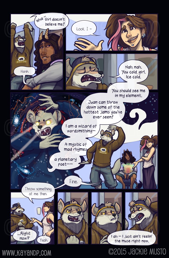
There are also some really wonderful mechanisms used to denote atmosphere in Kay and P; music is represented as coruscating ripples and waves of color, for instance, which communicates its feel so much better than a simple set of musical notes.
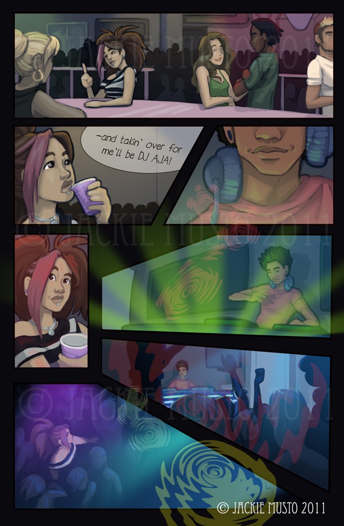
K and P is also one of the few urban fantasies that manages to invest daily life with magic without focusing so much on the magic that the daily life gets lost in the background. The two facets of Kay’s life weave effortlessly together, intermingling her life and her second sight into a gorgeous whole.
And that blending is done with wit and with a tongue in cheek grace that never ceases to catch the eye.
The comic explores a great many facets of Kay’s life, from romance to the difficulty of being a ‘special child’ whose parents never quite get it. As a reader, you’ll laugh and empathize with many of the emotions shown (especially if you’re an art student, because some of her jokes about art teachers are PRICELESS)
Like life, it’s not all fun, and Kay and P handles pathos as well as it handles humor; with empathy and a wry compassion that makes it strike home all the more. Dealing with the world when you’re different is HARD, and Kay and P explores that fully in several ways. I really enjoyed the way it handled the exploration of mental illness in our society as well as the explorations of social mores on the subjects of romance, relationships, and this concept we have of normality. But I have to say, I adore the humor. It’s intelligent without being unwieldy, relying heavily on repartee and situational drama/humor to move the story forward. Characterization is also well done. While some characters begin very much as caricatures (crazy landlady, nutty rapper) each character is given time to grow as a person, and yet we aren’t hit over the head with character life stories as so many urban fantasists insist on doing. The author strikes a perfect balance between reality and artistic license in the design and the execution of their characters. And they do a gorgeous job of pacing the story, breaking up weightier events with plenty of fun and occasional wacky situational humor that can ONLY happen when you’ve got the kind of life Kay does.
What Could Be Better:
I have to say, I’d have to get REEEAAAALLLLY fussy to find anything Kay and P needs to improve on. Occasionally hands and faces aren’t quite anatomically correct, but it works so well with the style that I don’t really see the point of complaining on the point.
In issues one, two and three there were a few too many talking head panels, but that problem was very quickly done away with, and at this point, I have almost nothing to comment on. Once in a while the lines get a little heavy and the highlighting can get a little overzealous and lead to some oddly over-bright patches on skin, but…yeah that’s pure nitpicking.
The Revue:
Rock on Jackie, your work’s DIVINE.
