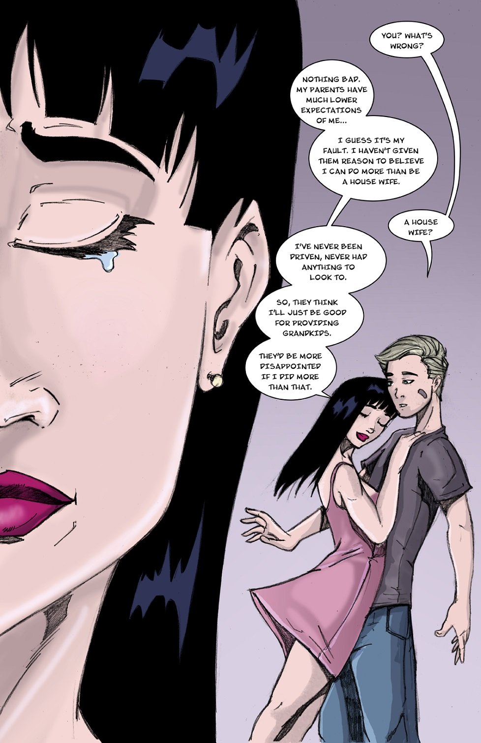
The Review Daemon: Center Lane
Today I’ll be reviewing Center Lane, a slice-of-life style webcomic by writer Christopher Galbreath and artist Rafa Lee. I’m also going to be experimenting with a bit of a different format and content for this review section. While “Why I Read” reviews are all about exposing potential new readers to comics we like, “The Review Daemon” is going to be more about providing critical feedback to comic creators to help them improve their craft. This means that I’m not going to hold back on what I think about a comic, good or bad, because you never improve if people don’t tell you what’s working and what’s not!
Anyways, on to the comic!
Synopsis:
Center Lane follows the life of emancipated 16 year old David Ramsey as he deals with his parents’ divorce, school, bullies, crushes, roommates, Evil Computer Demons, and work. You know, the usual teenage stuff. Well, mostly.
It’s mostly black and white, with color being a recent addition to the past several pages. It’s been running for almost two years, with a decently large archive to dive into.
Plot:
As a Slice-of-Life comic, Center Lane isn’t focused around a central plot as much as some other stories. It mostly just follows David as he goes to school and work and deals with his life and problems. This isn’t necessarily bad, as it’s just the type of comic that it is, but it can make the story start to drag when not much is happening. Some sort of overarching plot, a specific goal/objective that David was working towards, could go a long way to giving the comic cohesion, and to give it a bit more excitement.
That’s probably just my bias towards plot-drive stories talking, whereas I feel that Center Lane is striving to be more of a character driven one. So I’ll focus more of my thoughts and feedback there.
The major theme of the comic seems to be David dealing with bullying, self-image issues and prejudice about his young age of 16 while trying to live like an adult. These are themes that I couldn’t really identify with that strongly, personally, but they seem to be more meaningful to some of Center Lane‘s readers. Specifically, I had a hard time accepting the bullying theme, for reasons that I’ll get into in more detail as we talk about David’s motivations.
3/5
Characters:
Let’s start with David, our protagonist. To put it bluntly, I don’t like David very much, and struggle to identify with him. This unfortunately started on the very first page:
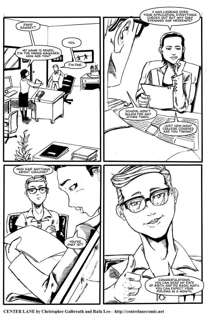
Sarcastic snark can be an endearing character trait, but David uses it too much. In the comments Galbreath explains that it’s a coping mechanism, but we aren’t really shown this in the comic itself, giving me a very negative first impression of David. This potential employer asks a legitimate question (with not too difficult a potential spin for it, either, as a go getter/hard working kid, etc), and David immediately reacts like a jerk. A jerk who comes up with cutting comebacks immediately instead of two weeks later while in the shower. In fact, I half expected it to be something that David imagined or said in his head, but no, it was real. On the next page David explains that he’s tired of getting reactions to his young age, but since this explanation comes AFTER his sarcastic outburst, it fell flat for me.
This is a good example, actually, of a larger concern I have with David as a character: he feels like a wish fulfillment character. Not quite to the level of Mary Sue (or Gary Stu or whatever the male equivalent is), but it feels like David as a character is semi-autobiographical for the author, but, due to his fictional nature, able to react differently (and better). David always has a witty retort for his bullies, and despite everyone in school thinking he is lame and bullying him (for no obvious reasons, not even nerd tropes or anything), several attractive older women hit on him repeatedly, and adult men seem to respect him. He simultaneously has both everything bad and good going for him. This dichotomy is not helped by the fact that in the comic, we see all of these good things happen (gets a job, hit on by two women, etc) before we are then told that he is unpopular in school, and no one likes him. It felt forced to me.
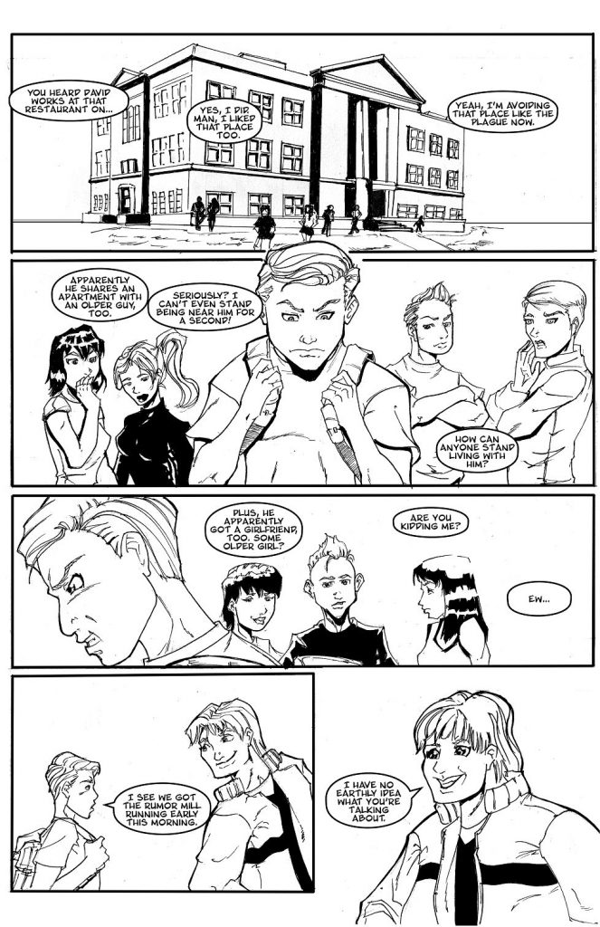
There are more things that bother me about David, but suffice it to say that I could not identify with him. Even when his motivations and thought processes are later presented in the comic dialogue, they did not align with how I had seen him act in earlier pages.

He LITERALLY just had multiple attractive women hit on him, and we haven’t seen ANY of this “social dud” stuff he’s talking about. It just feels out of order. If Galbreath had shown us WHY David feels this way before showing us many reasons why he SHOULDN’T, it would flow more naturally and help him progress as a character. Seeing these parts of his character out of order just made it confusing and jarring for me.
The supporting cast also struggles with their characterization, and are currently presented as fairly one dimensional. Their primary defining feature seems to be whether they love or hate David. Manuel, David’s primary bully, antagonizes and downright STALKS David around town as if he has nothing better to do than prove that David is lame and bother him. His boss, Valerie, as mentioned in the page copied above, is downright pedophilic in her attraction to David, hiring him as, no joke, “eye candy“.
His roommate Kyle is a bit better, being portrayed as a drunk and a womanizer at first but showing that he’s not through his later actions. Kyle, for me, is the most well developed and likable character, given the most opportunity to act meaningfully and grow, instead of being acted upon by other characters and plot. Going forward, I recommend that Galbreath give the other characters the same amount of development and growth as Kyle.
1/5
Dialogue:
The dialogue in Center Lane for the most part is decent. There are occasions of typos, awkward phrasing/word choice, and conversations where the dialogue didn’t flow naturally.
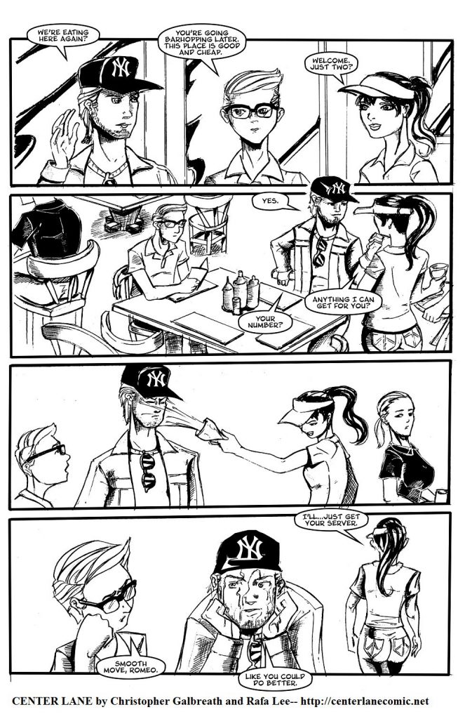
A good example of an unnatural flow of conversation/dialogue. What Kyle said did not warrant the reaction. For the most part, though, the dialogue is fine. It just doesn’t do a very good job of convincing me that characters feel the way they do, nor does it always flow naturally.
3/5
Art:
Lee’s obviously a capable artist. A look around his portfolios shows that he is quite competent with his line work, both pencils and inks. However, his work on Center Lane pages suffers from inconsistencies and what seems to be a lack of attention to detail. Characters often look different from page to page, or even within the same page. Perspectives and backgrounds are sometimes off and don’t make sense. Here’s an especially egregious example from near the beginning of the comic:
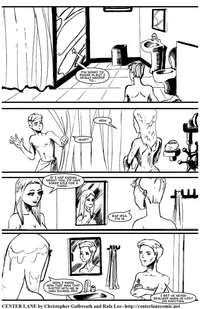
The layout of the room is strange, the characters look different each panel and have some strange anatomy, and Lee seems to have forgotten how mirrors work.
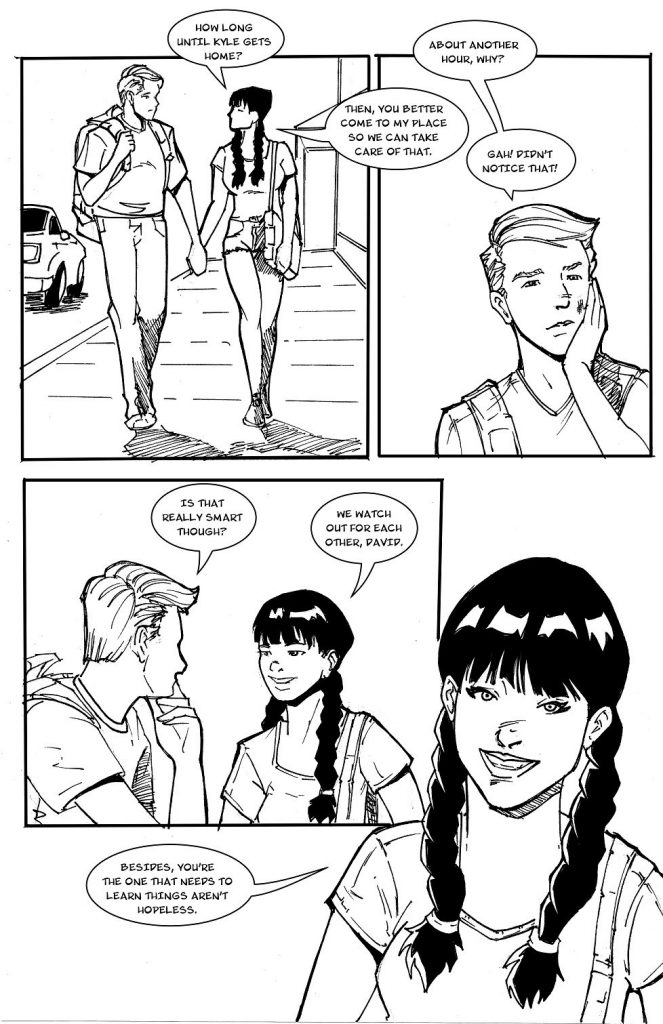
Later in the comic, Lee HAS improved in some ways, but the pages still suffer from inconsistencies with character appearance. Backgrounds and perspectives are MUCH better though, with better shading. In general the line art becomes crisper and more defined.
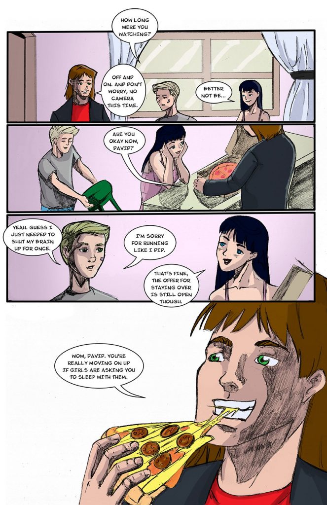
Recently, they’ve made a switch to coloring the pages. This is good, and gives much more variety and flavor to the pages. Unfortunately, this seems to have come with a decrease in quality of the line work. There is less attention to detail on faces and backgrounds, utilizing simple gradients instead of the more detailed backgrounds used previously. This may have been a purposeful time (and money) saving choice, but it is noticeably worse. It looks like whereas before the pencils were inked, the pages are now just pencilled and then colored.
Overall, the lesson to be learned her is that attention to detail does matter. Lee is definitely capable of high quality art, but doesn’t seem to have been giving his all on the comic pages.
2/5
Lettering:
Again, lettering for the most part is perfectly fine. Do be careful of occasionally the text abutting the edges of the dialogue balloons a little too closely, or not being centered well enough. There is also a whole bunch of stuff about whether or not capital I’s should have serifs or not (based on placement in a word), but I am not an expert on that, nor did I find the all serif I’s or the font distracting from the reading experience, which is all I’m really hoping for from a font.
3/5
Panelling:
There definitely were some problems with balloon placement and panelling choices as a whole that made reading difficult for me, though. Take this panel for example:
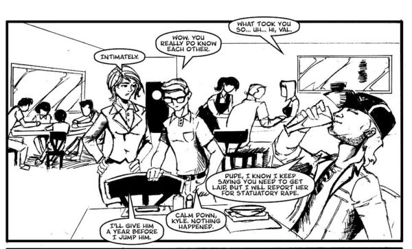
Normally I expect to read top to bottom, left to right. Here though, I need to start at the top right and work my way towards the bottom left. This happened because of where the characters are in the panel didn’t line up well with what order they needed to talk in. This sort of problem can be avoided by carefully planning out pages with sketches and thumbnails before getting to far into the art. For example, with this page, flipping the visual placement of characters left to right would have allowed he dialogue to flow more naturally, left to right.
Another thing to be aware of is making sure that panels set up the events of later panels. On the following page, there is nothing to indicate why Kyle is getting up and walking to the door until suddenly he opens it and Stacy is there.
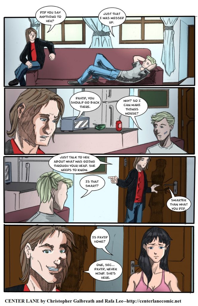
Some sort of sound effect, or dialogue to the effect of “someone’s at the door” would have set up the last panel better and constructed the flow of storytelling more nicely.
On a larger scale, the flow of the comic was often interrupted by ECD “filler” pages, short four panel pages from the Electric Computer Demon (a character I still don’t understand. Is it just for a joke? If it’s real, why aren’t people freaking out?) that Galbreath posted on weeks when there wasn’t a completed page. While I understand their usefulness as filler, they really break up the flow of the story, especially when there are 10 in a row.
3/5
Site:
Since Center Lane is a webcomic I’d be remiss to not at least include some thoughts on the site itself. Since I just barely mentioned it, the ECD filler pages could pretty easily be moved into their own section, out of the comic archive. This would allow readers to read through the story without jarring and potentially confusing interruptions.
Another tip would be to try to divide the story up into chapters if for no other purpose than organizing your Archive page. As is, it is a long stretch of pages with nothing to divide it. Creating story “arcs” to file them under would make accessing any particular page easier.
Other than that, the site works fine. It isn’t fancy, but it is functional. I like that there are multiple ways to navigate from page to page, including clicking on the image, navigation buttons, and arrow key movement. Good job with making using arrow keys within the comment box NOT navigate pages. I’ve had that problem before.
3/5
Summary:
Well, to summarize, I’ve been rather critical in this review. Center Lane is, in my opinion, a comic that needs a fair amount of adjust and fine tuning, both in terms of character and plot development and in terms of artistic attention to detail and consistency. I like Galbreath and want him to succeed, but currently don’t enjoy Center Lane that much. I can’t identify with the characters and their motivations or get that excited about the story as is. Going forward, I hope he continues to develop his characters and introduce some larger plot elements to drive the story forward. I also hope that Lee will be able to spend more time crafting the pages, so that they are consistently the level of quality I have seen him do.