The Review Daemon: Mysteries of the Arcana
We’ve finished another requested webcomic review, this one of J Gray’s tarot-inspired sci-fi/fantasy comic, Mysteries of the Arcana. Remember if you want to be reviewed, just email Dan 🙂
Synopsis:
Mysteries of the Arcana is a fantasy webcomic with a—you guessed it—arcana theme. What’s an arcana? Good question! Well, in the real world, arcana is a term that refers to the two different halves of the tarot card pack, but the major and minor arcana. I could start babbling on about the details, but you didn’t come here for tarot card information, now, did you? Besides, that’s what wikipedia is for.
So what is Arcana in this world? It’s actually a series of different dimensions and realities based around the different tarot cards and the people who are attuned to these Arcana. It combines elements of mythology, fantasy, and even some science-fiction to create a rich and complicated world. So why all the tarot card talk earlier?
So with that out of the way, let’s dive in.
Plot:
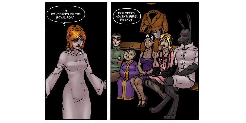
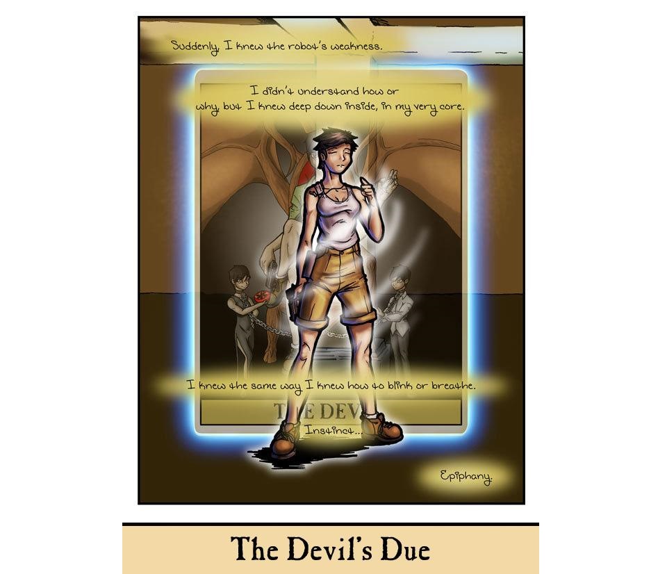
Theresa is a lost soul who has given up on life and decided to take matters into her own hands. Fate seems to have other plans, however, as she runs into an elf-like being who’s in serious trouble. Through some mysterious power, she is able to intuitively sense the weakness of the enemy attacking them and easily wins the fight. Later, she gets a proper introduction to her new friend, Chrystalline. The two share an instant mutual attraction, but Theresa is quick to push her away because of her Catholic background, which becomes even more troublesome when she realizes the pagan nature of her newfound powers (she especially doesn’t take it well when she discovers her Arcana is The Devil). Daunted, but determined to figure things out, she joins Chrystalline and her friend William in a search-and-rescue mission.
With considerable struggle, the trio rescues Chrystalline’s mother and they return to their hub, an inn between the Arcana. Chrystalline gets the bright idea to take Theresa to a place where they can go on a “quest”, which turns out to be a soul-searching quest Theresa really wasn’t ready to face. After a painful confrontation, the two go their separate ways. The inn owner then sends her patrons out to gather various supplies. Theresa, wanting to avoid Chrystalline, goes with William. During the mission, she learns more about her Arcana and how to confront her problems, while Chrystalline has a run-in with her father and the rest of the patrons get into all kinds of chaos.
After everyone has gathered their supplies, Theresa and Chrystalline have a heart-to-heart and agree to let bygones be bygones. The group is treated to a fascinating backstory for the comic’s universe and…well, if I go any further, I’d start spoiling too much.
What I like about this comic is there’s always something going on. It never feels like there’s a big lull in the action and the pacing is well-done. Long-winded as it is, my plot summary doesn’t really cover the complexity of the character development and mythos presented in the writing. However, one thing that really bugs me is there’s a section of strips around chapter six that bounce around and don’t seem to fit into the main story. They’re not even in the same art style and they come across as filler. That’s incredibly distracting and the archives really should organize things like this better. I’ll talk more about that later.
4/5
Characters:
I’ll keep my focus to the characters I found to be the most memorable. Most of them have something interesting about them, but there are a few key (pun intended) players that really stand out.
Theresa, the protagonist, is interesting as a deeply-conflicted individual. Many times throughout the story, we see her struggling with the discrepancies between her new life walking the Arcana and her Catholic upbringing. Her character development is slow but certain and comes at a believable pace. Even with her hang-ups, she’s always at the center of the action and remains active in the story while she works through her personal demons.
Chrystalline is a bit of a gadfly character who enjoys goading others. Usually, characters like this are annoying, but she shows in many ways that she has a good heart. When she acts rashly in an attempt to get Theresa to deal with some personal problems, the story makes it clear that she meant well. It makes her fairly sympathetic despite her mistakes. Most of the time, though, she’s a mischievous and upbeat character with a lot of experience walking the Arcana. She’s shown to be very capable at what she does, even if she requires help from time to time.
The last character I want to talk about is William. He stood out to me immediately for his anthropomorphic design, but there’s also his tendency to talk like he just stepped out of a Shakespeare play. I didn’t like it at first, but it grew on me. He’s a bit of a Don Quixote-type character, though not quite as obtuse, and he’s a fun to watch.
The other characters who stood out to me were Mandrake, with her interesting dialogue style (which I will talk about in a bit) and the Surgeon, who is your typical sarcastic AI. Beyond that, I felt like the rest of the cast was sort of meh. I appreciate the main characters, but I’d like to learn more about some of the side cast. Of course, recent pages seem to be doing just that, so I’d wager the writer has things well in hand.
4/5
Dialogue:
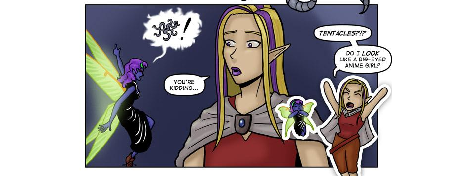
The dialogue works best when the characters are telling stories. The creator has a very fascinating lore, and that’s one of the major strong points of the comic. Usually, exposition is a bit of chore to read, but I find I really liked the storytelling bits the most. The parts I didn’t really go for were the comedic exchanges. Some of it manages to be a little funny, but most of the time, I felt like the humorous dialogue was either predictable or based on really tired jokes. Take this, for example.
For context, this is a scene where the characters are in outer space, quite literally dealing with space pirates. How does a joke about anime tentacles even fit in here? The arc itself was good, but jokes like that kind of take away from the momentum. The setups for sarcastic barbs are also really obvious sometimes. None of it ever really made me laugh.
3/5
Lettering:
I really like the lettering. It does everything it needs to do in order to facilitate dialog, but it goes above and beyond with lots of variety and creative choices. The fonts for sound effects are varied and well-chosen. I especially enjoy the lettering style for Mandrake, who speaks entirely in images. The images are chosen very well and I always felt like I understood well enough what she’s saying without needing words. She even manages to throw in some sarcasm, which is impressive. Overall, the lettering is about as perfect as it could be.
5/5
Art:
I like the art as a whole, but it’s all over the place. The character designs are memorable and creative, though I do feel like the anatomy is stiff. The colors are nice and bright and I like the variety in palette choices. Sometimes it’s really vibrant and other times it’s more washed-out, usually the fit the mood of the page. There are a lot of guest pages too, which can be very hit or miss. Sometimes they look great, and sometimes they’re…Legos for some reason.
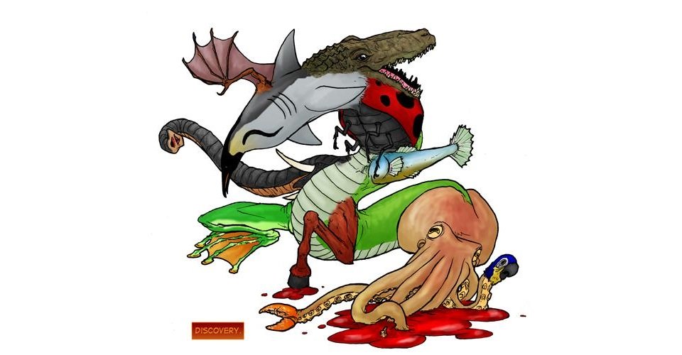
And then sometimes pages have incredibly strange stuff like this, which I can respect. This is some real creativity.
One thing I really don’t like are the occasional super-deformed shots. They’re used for comedic asides, but I don’t feel like the ultra-cartoony shift actually adds to the humor. Rather, it just kind of clashes. Also, the poses feel lifeless a lot of the time. There’s a lot of action in the story, but the motion doesn’t usually come through in the art too well. Later pages do manage to nail it and it certainly improves over time, however. Overall, I find the visuals unpredictable. Sometimes it’s actually really good, and other times it’s underwhelming. I’d say it’s slightly above-average overall, though, because when it’s good, it’s really good and when it’s bad, it’s just…meh.
3.5/5
Paneling and Visual Storytelling:
The paneling is darn good. First off, allow me to direct your attention to the fact that each and every single page is designed to look like a tarot card, complete with the title at the bottom of the page serving as the name of the “card”. That’s one of the most creative ideas I’ve seen for paneling and it suits the theme of the comic spectacularly.
The rest of the paneling serves its job effectively and experiments with different styles of visual storytelling. I’m very impressed by the artist’s ability to tell a story without words. There’s an entire 15-page sequence that manages to tell an incredibly depressing backstory without a single word. The comic later expounds on these details, but I understood perfectly what that sequence was going for even without the extra exposition. The artist of this comic has a sure and versatile hand at visual storytelling that makes for a significant asset to the comic as a whole.
5/5
Website:
The website is a bit of a mess. On the positives, everything is easy to find, with simple navigation and links to the cast, extras, archives, and anything else you would want on the left-hand side of the page. Personally, I prefer these types of links at the top of the page instead, but it works fine where it is. The visuals of the site are heavy on black and gold with some runes and symbols maintaining the overall theme. However, while the design choices are nice and cohesive, I find the ads intrude on this a lot. Now, ads are something that’s hard to help, since creators often need them to get revenue, and the site does keep them neatly organized. Still, they really clash with the look the site is going for. It’s a little unfortunate.
The archives have a serious problem. I mentioned before that there was a bunch of seemingly-unrelated guest pages. If you check the archives, these pages are grouped together properly, but they just show up out of nowhere when the reader is navigating the comic normally. These pages should not be interrupting the comic mid-story. There’s also a duplicate page in there, too. I’ve seen worse, but this is still really messy work.
As a side note, I find that some of the information in the cast page doesn’t reflect how the characters are in the comic. That’s not a knock on the website design itself, but for example, Blue has a really interesting bio that doesn’t really come through in the story itself, and a few others on the cast page also suffer from that. I would like to see these details come up more often in the comic.
3/5
Summary:
This is an interesting comic that uses a lot of classical references and ideas in a fresh way. I find the character development is well-done and realistic, which is a big asset to the storytelling. Some parts of the comic could use more polish, especially when it comes the attempts at humor. I like the variety in the art, but it could be more cohesive and the website could use some improvements. Still, this is a pretty good read, so check it out if you like fantasy.


