The Review Daemon: Commander Cottontail
We’ve got another requested review/critique up, on another of Wendy Heather Wood‘s comics, Commander Cottontail. Reminder that if you want to get your comic reviewed in this similar style you can email dan at demonarchives dot com.
Synopsis
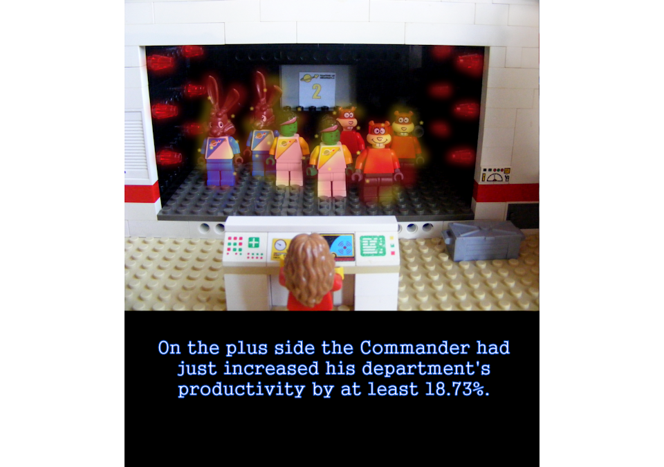
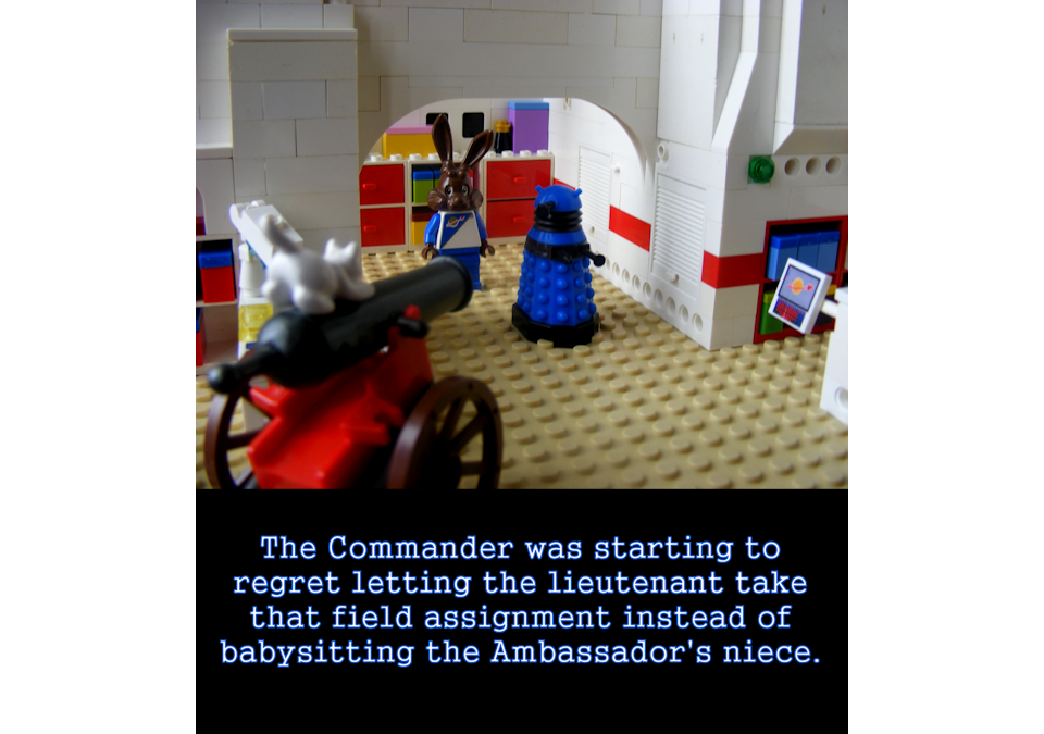
Commander Cottontail is a gag comic following the random adventures of a spaceship crew dealing with diplomacy, sci-fi weirdness, and crewmate shenanigans. This isn’t anything new, but this comic has the unique claim of being a photographic webcomic, in which all strips are photos of (mostly) Lego figurines. To call this comic strange is…probably an understatement. On top of the unusual choice of medium, this comic likes to work in a lot of referential humor. Lego, Doctor Who, Star Trek, Star Wars, Spongebob, Sanrio—it’s a sampler’s platter of references.
It occasionally likes to go meta, too, so watch out for that.
Plot:
This is mostly a gag-a-day comic that has the occasional arc following various common science fiction jokes, like clone situations and other tech-gone-wrong. You could read most of the comics and still get the joke without the buildup, which is a decent accomplishment. A lot of recurring gags sneak in as well, but still make sense without requiring the reader to troll through the entire archives to get it. However, that’s partly because many of those gags have been done many times over, and the same is true of the plotlines that do crop up. Overall, it’s an average effort. It’s nothing special, but it’s not bad. Plus it deserves a lot of credit for having over 460 updates.
3/5
Characters:
Most of these characters feel like stock characters. You have Commander Cottontail, the beleaguered diplomat trying to negotiate with the temperamental Hello Kitty and Dalek ambassadors. You have the Lieutenant, who’s generally a naïve sidekick. You have the weird, pushy higher-ups. Quirky officers. All kinds of extras. These aren’t bad characters, but they don’t stand out much.
2.5/5
Dialogue:
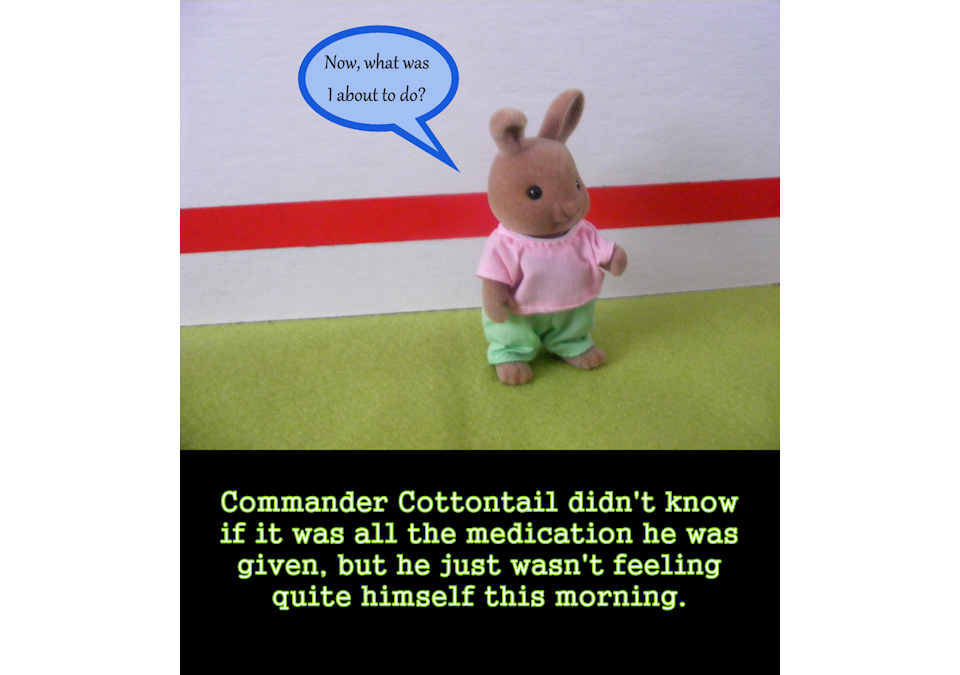
You could skip the dialogue on basically every single page and just read the caption below. That’s pretty troublesome, because while there are other comics that put a caption below the strip, it often comes across as explaining the joke. Some of these jokes are kind of old or just not very funny, either.
1/5
Lettering:
There’s just no nice way to say this. The lettering looks awful. The bare minimum of lettering is that it must be legible, and that it is. The problem is it really doesn’t gel with the way the comic looks. It’s difficult to make word bubbles look good next to photographs in the first place, since they tend to stand out in a really jarring way. They just never look like they “belong”. The thick lines and bad font choice doesn’t help matters. The lettering at the bottom of the pages does look better, but I chalk that up mostly to that part of the lettering being set in the gutter below the image.
1.5/5
Art:
Did I mention this comic consists of almost nothing but photographs of figurines? Because I wasn’t joking.
I have to admit, that turned me off right away, but after reading through the comic, I admit I do admire the creativity that went into this idea. I don’t necessarily like the stylistic choice, but let’s take a step back for a moment and just look at these photos on their own merit. First of all, the sets the characters are put in are actually really detailed and well-composed. The quality of the photographs is also really good. The lighting looks nice, the angles are appealing, and the photos make use of various depths of field. The creator has a good eye as a photographer and knows how to compose an image well.
So why do I still not like it? Well, the main issue is that figurines are extremely limited. The lego characters are capable of some motion, but it’s inherently stiff and awkward and aside from putting angry eyebrows in the figurines, there’s no way for them to emote. Another problem is the figurines just look weird together. The comic doesn’t stick with just legos, it kind of throws a little of everything in. Why is Sandy from Spongebob here? Why is Hello Kitty part of the crew? Is Commander Cottontail supposed to be a chocolate Easter bunny? Rather than a quirky melting pot, it just comes across as a confusing hodgepodge, and the special effects that get thrown in later on just clash with the visuals further. I give the creator credit for having a unique idea and having some pretty darn good camera skills, but the end result really doesn’t do it for me.
2.5/5
Paneling and Visual Storytelling:
This comic seems to follow the same style as The Far Side of New Yorker comics when it comes to panel layout. That is, every single strip is a single image with a caption below. There is zero variety and it gets dull and repetitive right quick.
2/5
Website:
The website is passable. It’s just your typical template. It’s got pages. It’s got archives. Anything you’d expect from a webcomic, it’s got it. I’m not a fan of the overall look of the site, though. It’s pretty bland. The Extras page seems to be lacking in content, as well. All it has is a single strip (albeit an amusing Magritte reference) that seems like it would belong with the rest of the archives. It’s puzzling that this page of the website even exists.
3/5
Summary:
I suppose Lego fans and science fiction junkies would be the ones most likely to appreciate this. The photography is pretty good, and I admire the dedication, but in my opinion it’s an awkward style choice for a webcomic and I find the joke format gets stale after a short while. While not my personal cup of tea, give it a read and decide for yourself.

