The Review Daemon: Heracles Knot
Another guest review up, this one on Sid Hargrave’s Heracles Knot, another SpiderForest comic. I’ve made some additional comments here and there on things I found pertinent (because the reviewer was looking at the Comic Fury mirror instead of the main site), as well as my traditional snarky captions 😉
![]()
Synopsis:
Heracles Knot, created by Sid, is an urban fantasy comic about an organization that manages magical creatures and incidents, while keeping the whole matter quietly under wraps from an unsuspecting world. While on a mission, they discover a mysterious plague with seemingly no cure—or so they thought.
Plot:
What’s the story about, exactly? Well, according to the summary:
“Leland Henderson and his best friend Jaida Warner are training to become Wardens. They handle diplomatic disputes between faeries, hunt down hostile creatures, and basically work to keep the majority of humankind from knowing these things exist. There’s more to being a Warden than just grunt work, though, and something dark is brewing on the horizon.”
Seems interesting, right? Except…some of the things the summary lists aren’t developed all that well in the plot. As far as I can tell, the main plot seems to be this; a group of characters come across a mysterious deadly plague that’s become increasingly widespread among magical creatures. The main protagonist, Leland, contracts the plague and manages to expel it, meaning he is capable of generating a potential cure. The cure is indeed devised, and it becomes apparent that the plague is a modified strain that has no effect on humans, warranting a serious investigation into the matter.
The first symptom, a rash, appears fairly early, but the comic doesn’t bother to even say what it is in the first chapter, and we don’t even find out what it is until eighty-eight pages in, before finally going into detail about it in a graphic prose chapter. I can appreciate a story taking its time, but the first chapter dragged a little. The characters drive around, lightly banter, talk about a mission that’s not clearly defined, and get into a fight with somebody the protagonist apparently knew at some point. In sixty-eight pages, I still wasn’t sure what the point of the story was. It takes a while for plot threads to pull together and in the meantime, it’s…
…well, it’s just too vague for its own good. The substance is there, but figuring out how it ties together or why it matters is a real mystery. The knot isn’t so much Heracles as it is Gordian.
The writing gains some focus over time, but the development remains disjointed. Let’s go back to that summary; Leland plays a big role in the story, but Jaida’s role is rather small by comparison. She certainly doesn’t stand out as a protagonist. If anything, the group leader, Constantine, seemed to be more of a protagonist, since he’s at the center of every major event. And other questions remain. Why does Leland want to be a Warden? How did the characters end up where they are? What’s the point?
I don’t think the plot is pulled together enough to really answer that yet.
2.5/5
Characters:
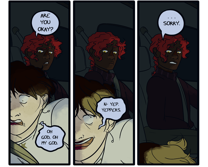
Part of the problem with the writing is the ill-defined relationships between the characters. Everybody seems to have one of two kinds of relationships; the first is a very formal, stilted, professional type of relationship. The other is one of ambiguous familiarity that allows for a certain degree of friendly teasing. The only outlier in this is the occasional antagonistic relationship, but that doesn’t come into play much past the first two chapters. That aside, there are characters who seem to go way back, but I don’t know how or why. Are they all friends? Are any of them family? How do they know each other? Why do they care about each other? Even at times when the answer is spelled out plainly, we don’t get to actually see it unfold. It’s told after the fact. The story tries its very best to include small, subtle moments indicating familiarity, but like the storytelling for the plot, it’s a little too vague for me.
The personalities of the characters also lack many distinguishing qualities. They emote and react to things, but their personalities lack any particular quirks, habits, or anything that makes them seem special. Even the protagonist is hard to pin down beyond “serious and moody, but sometimes personable.” Part of the issue might be that there are simply way too many characters in the story and not enough room to properly develop them. Probably the character with the most defined personality is Constantine, but like main other cast members, his main trait seems to be “serious,” and while it’s not a bad trait to have by nature, when so many others share a similar disposition, it can make them seem a little boring.
However, I will note that the graphic prose chapter does a better job at characterizing the cast. Perhaps it’s because of the nature of prose when it comes to a character’s thoughts; in prose form, the author is free to explore what they’re feeling at the moment regardless of how they might outwardly react.
2.5/5
Dialogue:
I’ve already said my piece about the vague plot progression, and the dialogue has the same problem. It jumps around, talking about what’s going on without really explaining or showing why it matters. They allude to the things going on in their lives, but it’s uncertain how it connects, or if it’s even relevant at all. They’ll also talk about things like how they plan to go about a mission, but not show why they’re doing it in the first place.
Aside from that, I will admit that the way the characters talk sounds pretty natural. I never really felt like their lines sounded too forced. I didn’t glean much information from them either, but the word choices do sound like something I’d expect to hear from real people. It’s a little better done in the graphic prose section, in my opinion. The prose, in fact, was generally written well and probably was the most direct and focused portion of the comic so far. It’s probably the strongest writing the comic has to offer.
3/5
Lettering:
No complaints here. The lettering is nice and clear and the font looks good. The placement of the word bubbles is also generally well-chosen. I admit, the letting style doesn’t leave a big impression, but there’s nothing wrong with it.
Now, the graphic prose section, on the other hand, does catch my attention. The composition of those pages, which I’ll elaborate on later, is very nicely done. The use of a serif font gives it a more bookish look, rather than a comic look. The color scheme for these sections—warm light grey text over a dark muted lavender—is very pleasing to look at, and the spacing and size of the text is neither too cramped nor too far spaced out.
4/5
Art:
Right from the start, I noticed that the anatomy and posing in this comic were definitely a cut above. The author has a really strong grasp on these fundamentals. I’m quite impressed with how fluid the hand gestures are. The character designs, as well, are also pretty good. Everybody looks distinct from each other, though I can’t help noticing a bit of monotony with some of the expressions. Neutral expressions pop up frequently, and while they don’t look bad, they don’t communicate much, either.
The colors in the comic need some work. Sometimes the comic manages to make them look good, but much of the time, they’re washed out and dull. Even pages that should have bright light are almost always plagued by drab hues. For example, look at the fire in these panels.
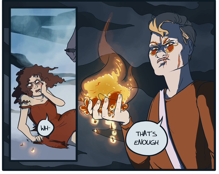
Something is off about the color choices here. For one thing, the orange used is closer to brown. For another, the panels are still dominated with cool tones. The fire doesn’t even make the color of his hand warm in tone. Even when the comic does use brighter colors, they always seem to look somewhat lifeless and flat. The darker pages also have trouble with contrast. Sometimes it’s hard to see. This is especially a problem with characters who have dark skin. The shade of their skin is sometimes inconsistent from pages to page and ends up so dark that I can’t properly see their face.
The early pages had too many panels with no background, but in defense of the comic, the problem becomes less and less prevalent over time. In fact, over time, the comic has actually made some really good background shots. I have to give it props for that, but it still strays back into blank, featureless backgrounds even now.
3.5/5
Paneling and Visual Storytelling
The composition of many of the pages gets stale pretty quickly. It over-relies on close-ups and bust shots. There’s nothing wrong with those specific angles, but I would like to see more variety. Even in the later pages, there are too many examples where a page has what seems like the same basic shot with minimal variations.
On the other hand, the way the panels are organized is always nice and clear. I never had any problem following the action or figuring out which direction to read. This was especially crucial in the graphic prose chapter, and it nailed the page composition almost perfectly. Not only was the text pleasing to look at, but it was arranged around one or two central images surrounded by a smoke-like border. Plus, it gets creative with the medium of text here and there. Not everybody is going appreciate the use of graphic prose, but for my part, I rather liked how it was handled. My only complaint is sometimes those pages ended mid-sentence, carrying the rest over at the top of the next page. That’s common in books, but it doesn’t work so well in this format.
4/5
Website
Heracles Knot is hosted on ComicFury and makes use of its customization options to craft a nice-looking page. The problem is, the way the navigation is set up really favors style over function. For some strange reason, the navigation bar isn’t on the top as usual. Instead, it’s on the right-hand side of the page, which is already an odd placement. I wouldn’t mind this so much if the tabs were clear on where they lead, but instead of just saying where they go, they…well, they look like this (rotated 90 degrees for web formatting).
![]()
Eventually, you’ll notice the letters hidden on the tabs indicating where they go. Took me a while to notice it. I just hovered over them with the cursor until the browser previewed the destination URL at the bottom of the screen. Imagine trying to figure it out on mobile, though. The page navigation also has the same kind of icons, but at least it’s easy to deduce where they go since ComicFury has a set order these arrows go in.
Sid. Listen. Your website looks very nice, but navigation should be intuitive before anything else. Artistic icons are worthless if they don’t make it abundantly clear where the link takes you.
[Dan Note: On the main site, not the Comic Fury mirror, these buttons are MUCH clearer. So good job improving that already, bumping up score to recognize that, but not too much because the Archives page only lists the first Chapter and interlude and nothing else, making navigating between chapters while setting this up fairly difficult with only the drop-down page menu.]

3.5/5
Summary:
This is a comic badly in need of some focus. The cast jumps from underdeveloped character to underdeveloped character and the plot takes forever to even approach a possible goal or motivation. Art-wise, the choice to use graphic prose for one of the chapters was an interesting turn. I won’t knock it for trying something different and I actually thought it was written well, but this style of storytelling may not appeal to everyone.
It seems like this comic wants to do a lot, but it’s taking a long time to tie crucial elements together and establish the main take-away of the story.