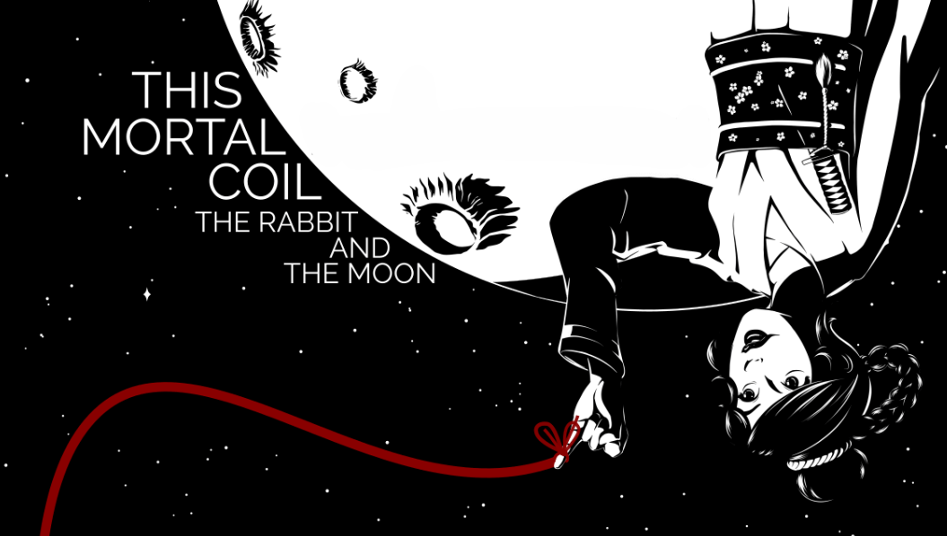
The Review Daemon: This Mortal Coil
Alright, I’ve been sitting on some of these guest reviews for too long, slacking on getting them posted! Here is Glenn Song’s This Mortal Coil. Don’t worry, I’ll make my traditional snarky captions 😉
Synopsis:
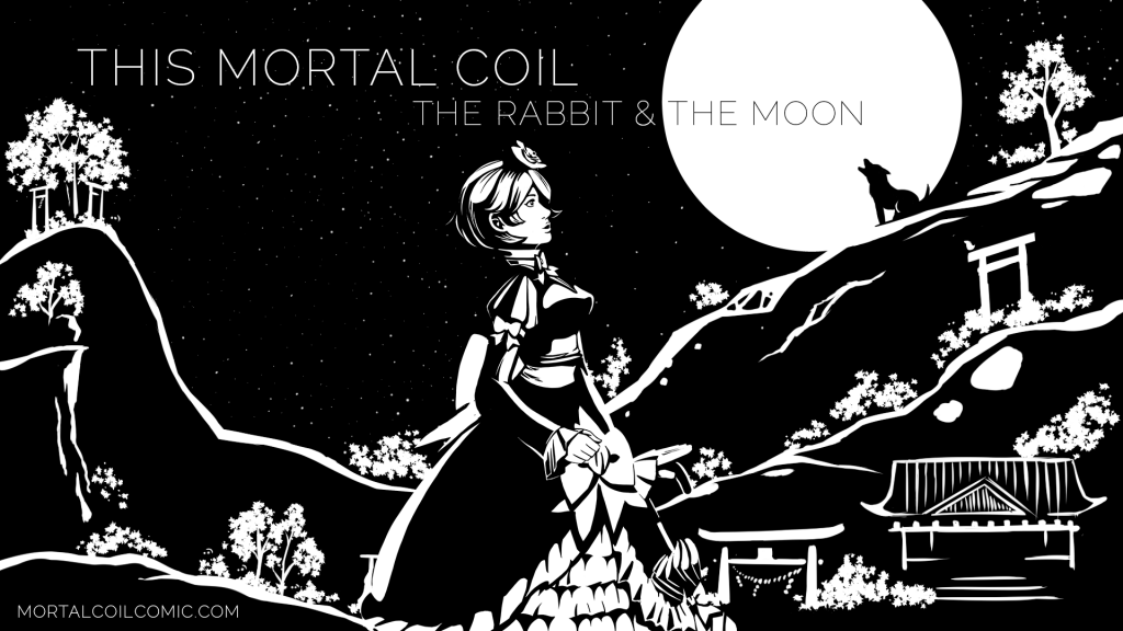
Welcome to This Mortal Coil, a fantasy comic about a mysterious godlike girl named Kamiko who wanders between life and death and between the moon and the earth. Who is she, and what part does she play in the grand scheme of things? That’s what this comic sets out to unravel.
Plot:
There are a few different comics on this website, but the meat of the story is found in The Rabbit and the Moon. Here, we begin with the archer Houyi battling a wolf god with the intention of becoming immortal by drinking his blood. When the wolf threatens to kill his wife, Chang’e, the woman in the moon, he is trapped inside a pot, poisoned and sealed away.
Surely he’ll never get out of there, right? Ha. Fat chance.
The wolf makes good on his promise and attacks Chang’e and her companion, a rabbit named Jade who can craft the Elixir of Immortality. The rabbit escapes to earth, and our main protagonist, Kamiko, enters the scene. Kamiko, a friend of Chang’e, vows to go to earth, find Jade, and bring back a cure for the poison that’s killing her.
Meanwhile, in Japan, two sisters named Natsumi and Hana witness a mysterious luminous object fall from the heavens…
What follows from here is a collision of several storylines with Kamiko at the center of them all, tying the characters together. It’s fitting that the red ribbon of destiny is her motif and the motif of the story arc as a whole. It would take quite a long time to explain how all the subplots tie in, and longer still to explain how the shorter story arcs elsewhere on the site tie into this one. But even at its simplest level, the adapted folklore and creative meshing of ancient tales and magic with modern times makes for a fascinating read.
5/5
Characters:
Oh, that main character. What a fun, carefree, quirky creature she is! Kamiko is vibrant, feisty, and childish yet caring. Most of the time, godlike characters are incomprehensible and hard to relate to, but this character feels so human and alive. If it were just her, I’d say the comic already has something good going for it with the characters, but the rest of the cast is also great in their own ways.
I’ll try not to spoil exactly how, but there’s a connection between Kamiko and Natsumi, and the way Hana interacts with both of them feels very organic. Hana and Natsumi especially act exactly like real siblings would, right down to Hana chiding her sister in shock after being shot by an arrow. I totally believe those two grew up together, driving each other crazy but still being close to one another.
Kamiko’s relationship with her long-time associates, in the meanwhile, has a similar tone. The characters constantly chide her and react with weary resignation at her silly antics, while still valuing her presence and company.
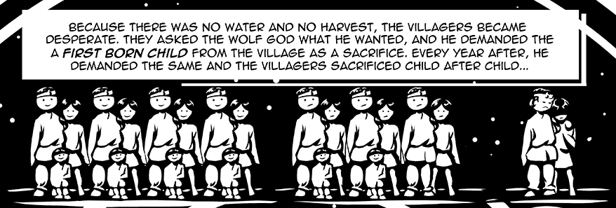
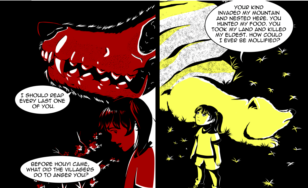
What really strikes me as impressive, though, is the character of the wolf god. He is set up early on as an antagonist and sets in motion the events of The Rabbit and the Moon. He is vengeful, cruel, and brutal, and the humans fear him for good reason. And Houyi, of course, has his own perfectly understandable reasons for wanting to slay the wolf and drink his blood.
And yet, he has depth of his own, as he reveals to Hana the reason for his hatred of the humans. By the end of the story, I felt more sorry for him than anything, despite all he had done.
Overall, I’d say the cast as a whole is quite finely balanced and gets fleshed out in interesting ways.
5/5
Dialogue:
The dialogue is good, but not one of the comic’s notable features. There were never times it sounded forced or wooden, but there aren’t a lot of especially memorable lines. Perhaps some of the characters have a little too serious of a manner of speech. This is mostly apparent when comparing how Kamiko (and Natsumi) speaks to how everyone else speaks. It seems as though Kamiko is the funny man to everyone’s straight man. While I like the exchanges that take place, there seems to be a lack of variety in “voice.” Hana is the only other character who seems to have a manner of speaking that’s specific to her, but it’s just the dialogue of a typical young girl. There’s nothing wrong with it, but there’s not much to say about it either.
That’s really the only criticism I have, though. The comic has so many great qualities that it overshadows the dialogue writing, which isn’t particularly flawed, but also doesn’t have anything specific that makes it special. I can’t fault it much.
4/5
Lettering:
As with the dialogue, there isn’t much to say about the lettering, but in this case, that’s not really a bad thing. In fact, not standing out is a good thing here. I’m sure there could have been ways to make the lettering style more unique or specific to the comic’s style, but let’s talk about the subtle things it does right.
Lettering is just a way to tell the audience what’s going on. At worst, it can be so badly done that it ends up confusing the reader. At best, it’s so visually attuned to the comic that it looks like it belongs on the page. This comic succeeds at a happy medium of being without a presence. The art is so simple yet intricate, and it would be easy to have lettering that accidentally distracts from the visuals when there is so much black on every page, yet the placement of the word bubbles is precise enough that the eye is always drawn to the art first. Combined with some fairly good sound effects and a nice, simple choice of standard font, and I’d say this lettering is exactly what it should be. That is to say, it’s totally forgettable, but that’s precisely the best handling for the lettering when placed next to this style of art.
4.5/5
Art:
I mean, just look at it!
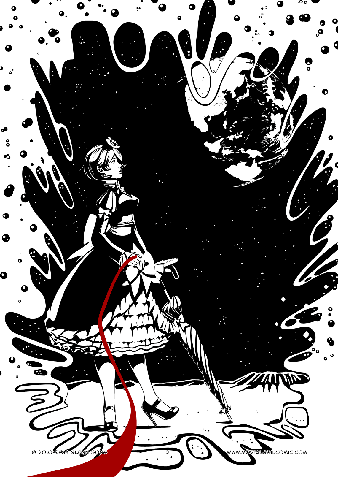
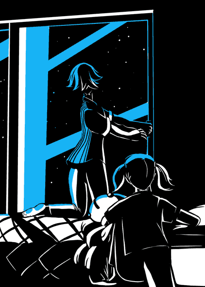
This comic has a beautiful, distinctive high-contrast style. Most of the comic is black and white, focusing on contours to create shapes, rather than just linework. When color does come into play, it’s usually with a certain meaning. Specific colors are used to represent one or two things. For example, red is usually used for blood, while blue, as seen below, is connected to the Elixir of Immortality or the flower used to create the elixir. Color almost always indicates something significant, and the simple primary and secondary hues the comic uses combine nicely with the heavy darks and extreme brights.
Although used sparingly, the comic also dips into the occasional animated page. And when it does, it does so spectacularly. Very spectacularly. It’s always welcome to see webcomics take advantage of the potential of their own medium.
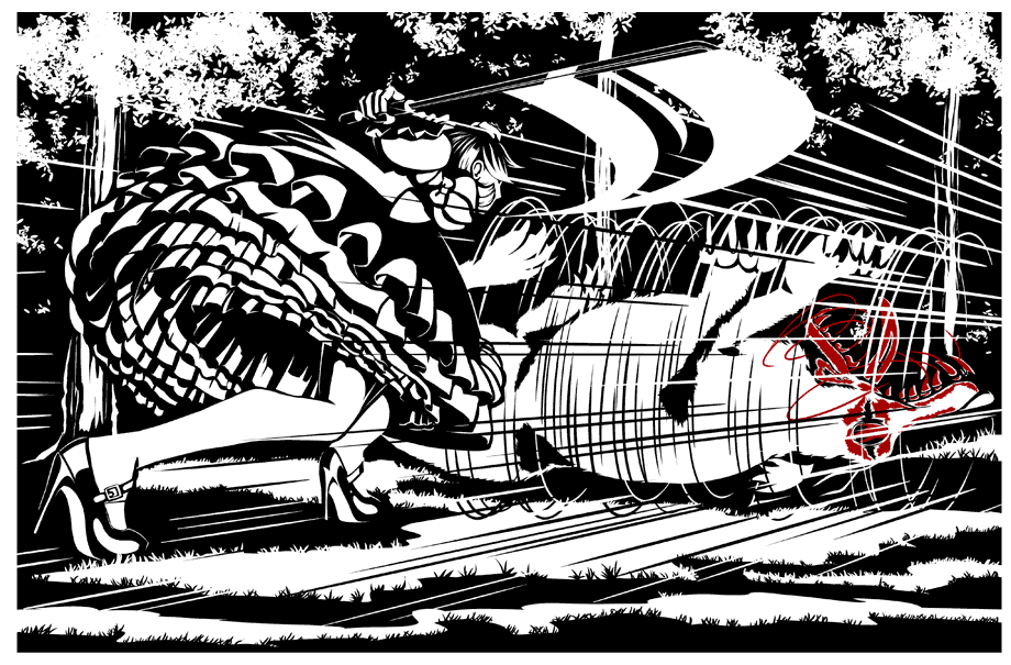
If I had to name anything that seems like anything approaching a drawback here, it’s that sometimes the page is too busy. To the artist’s credit, I never had a problem understanding what was going on, but there were times when the finer details were lost because there were just too many of them. Normally, I like very detailed comics, but because this particular style is so high-contrast, sometimes it’s better to keep it simple. The image below is one of the clearer examples of that, with speed-lines and lots of background details clashing to make the page look messy and confusing.
However, I should point out this is only an occasional issue. Most of the time, the detail focuses on the right things. If I had to name one other possible problem, it’s that some of the comedic expressions don’t work. The art style looks better when it’s being serious. The funny faces the characters pull have a tendency to look a little bit flat.
4.5/5
Paneling & Visual Storytelling:
The paneling is simple but effective. Most of the panels are just rectangles, nothing too unique, but anything more elaborate would get in the way of the art. Sometimes the panels seem to overlap a bit, blending the action together. I found that to be especially effective on this page, where the minimal visuals represent sound and motion, rather than what the character sees. I really don’t have any critiques on the paneling style. It’s simple when it needs to be, but isn’t afraid to try something creative every now and then.
4.5/5
Website:
Alas, the website is the biggest problem with this comic. It does look very nice and has some neat extras, like the shrine, but the functionality isn’t exactly optimal for reading the comic itself.
First of all, it’s hard to figure out what to read first. Upon visiting the site, you reach the most recent page. There’s a link in the upper right hang corner for new readers, but the page it takes you to isn’t really the best page to start reading at; instead, you go to the first page of the current chapter. The archives aren’t much help either. While I think all the content in the archives is worth reading, I suggest you start here, if you want to dive into the story.
The other problem I have with the website is the way the pages navigate. There are no arrows here. You have to open a drop-down list at the bottom of the page, select the page you want to go to, and click Submit. If you just want to proceed to the next page, you can also just click on the page, but for some reason, the page remains scrolled down. Instead of loading you back at the top, you have to scroll back up yourself, then scroll back down to read the page. It gets tedious, and it does a disservice to those animated pages, since you’ll miss the initial animation scrolling back up and have to wait for it to loop again to see it properly.
Finally, the archives for The Rabbit and the Moon end with a retrospective and a bunch of concept art. They’re interesting, but I’d really rather see things like that confined to their own section instead of being attached to the main chapter.
This is a good comic overall, but these website issues get in the way of the experience. Just making it easier for readers to start at the beginning and fixing the scrolling issues would be a major boon to the project.
2/5
Summary:
Overall, I’d say this comic is well worth checking out. It’s creative, beautifully illustrated, and has a wonderfully whimsical appeal while still rooting the storytelling in deeper, more complex ideas. It’s not only worth reading, it’s worth reading more than once. This comic has layers. It’s a fun story the first time you go through it, but it doesn’t strike you how thoughtful it can be all at once. You need to experience it over and over again to let it all soak in, and the writing doesn’t show its hand completely. It requires the reader to put in a little bit of thought on the fine details, while still making it easy to understand the major arc of the story. That’s a sign of a skilled writer.